Embed Snaps via an iframe
Learn how to embed beautiful code snippets on your own website / blog
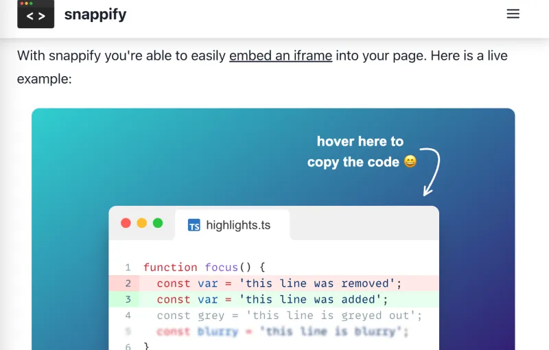
Snappify gives you the ability to embed your snaps in an interactive way (users can easily copy the code) on basically any website via an iframe.
Some example use cases are:
- A technical blog where you’re describing some code
- Docs where you’re showing off code examples
- Any other website / webapp where you want to show off interactive code snippets 😄
How to
Click on the “Share” button on the Editor page.
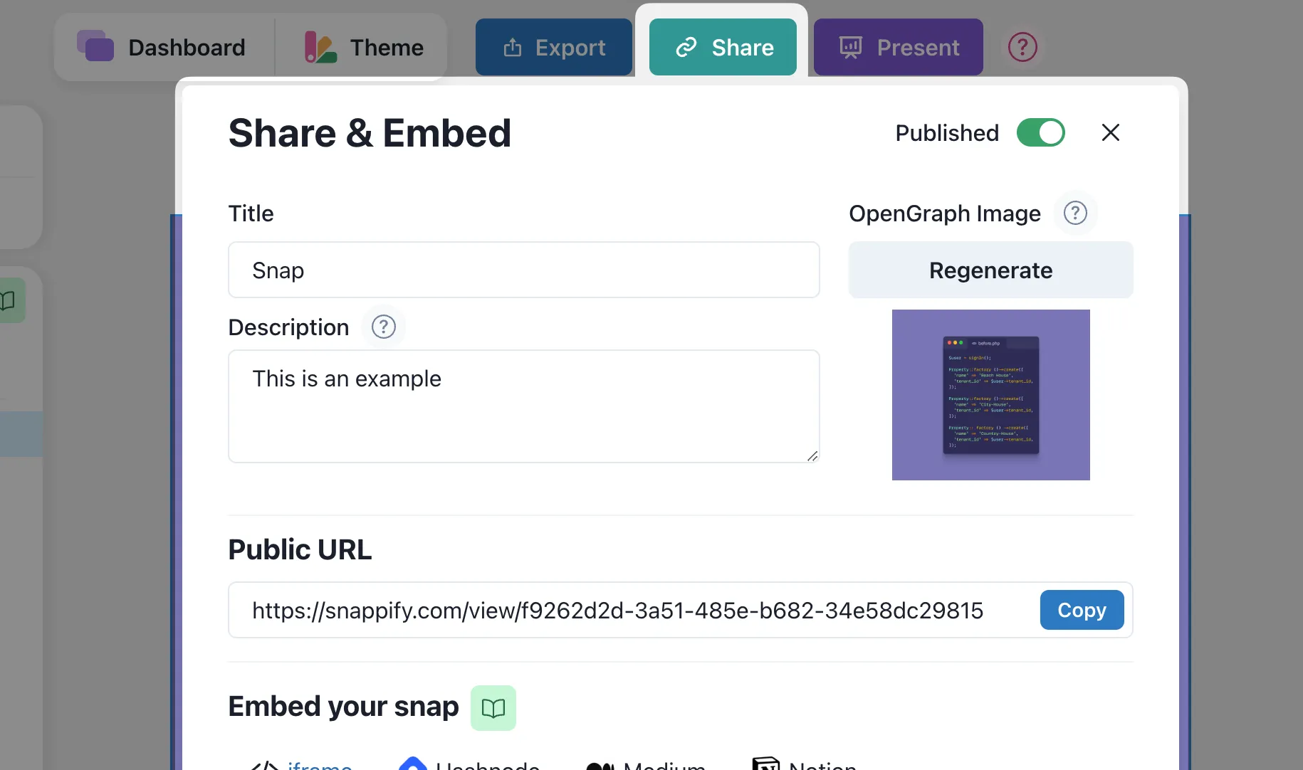
The embed modal opens up and the iframe Tab is opened by default. There you can see the desired HTML snippet for embedding the snap into your website.
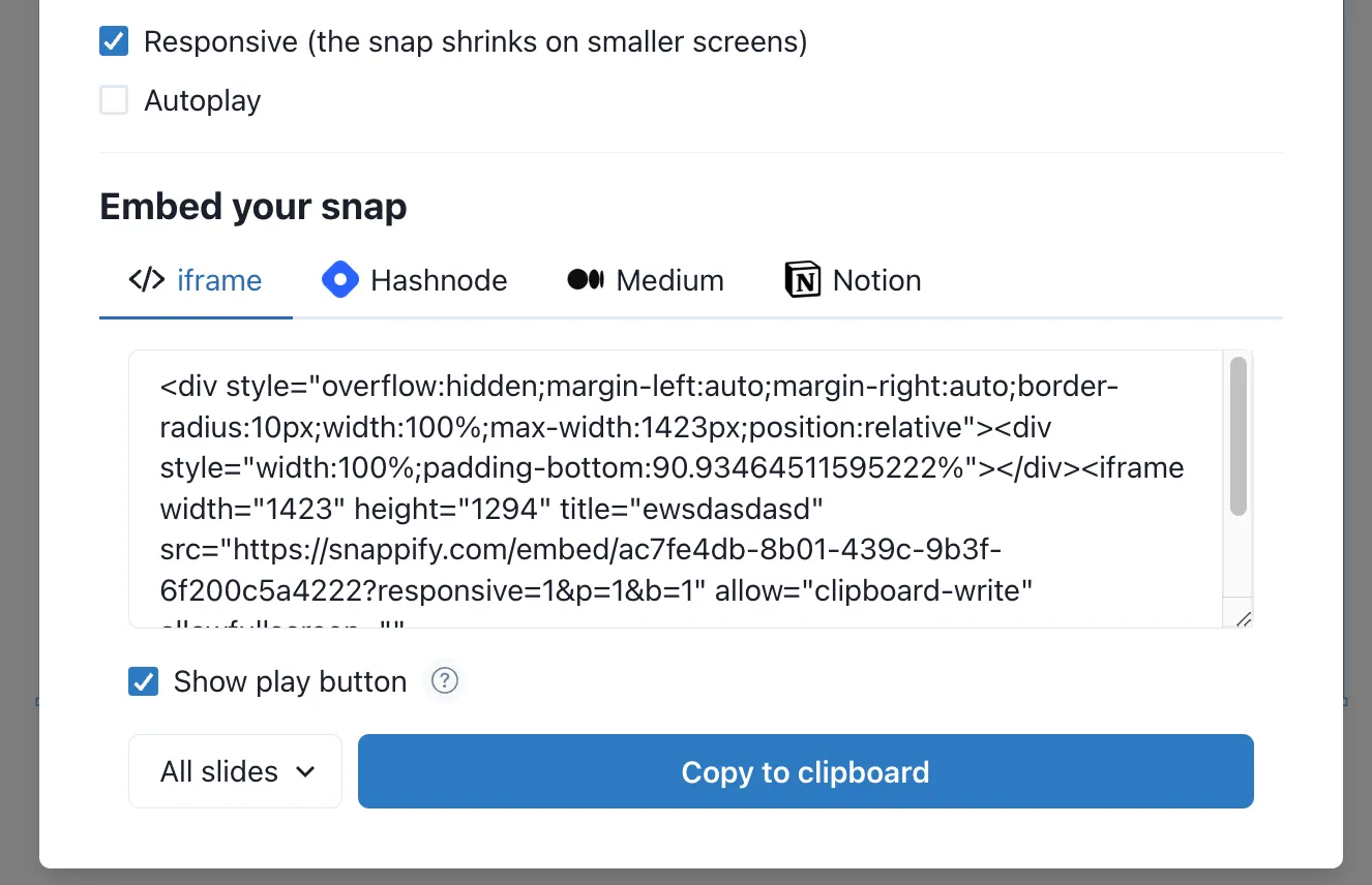
Embedding options
As you can see there are multiple settings to configure for embedding. Let’s learn more about them. 👇
Responsive Snaps
By default the checkbox for making the embedded snaps responsive is checked. That means that your snap will shrink in size on smaller screens and will be centered on larger screens.
This means that snappify takes care of displaying your snap in an responsive way so that it won’t be cut-off on mobile devices. Here you can see is a real example of an responsive embedded snap (will be scaled down on mobile devices):
Examples
Here you can see some real world examples of responsive snaps:
Do you have embedded snaps on your website? Send them to us, we’d love to add them to our examples!
Fixed Size Snaps
Here you can see the same snap as above, but in the non-responsive mode so it won’t be scaled down automatically. It will preserve its size and the user can scroll to view the full snap on smaller screens.
Examples
Here’s a real world example of fixed snaps. The user created two versions (mobile and desktop) and displays them accordingly, depending on the screen size:
Autoplay
When you have multiple slides on your snap, you can use this option to automatically play through all slides.
Show play button
This option will be only visible when you want to embed all slides of your snap and is active by default. It will show a play button on the embedded snap so that the user can start the slides presentation.
By disabling this option the slides presentation will start automatically when the user opens the website.
Embedding single slides
When you want to embed a single slide of your snap, you can do so by selecting the slide number in the dropdown beside the copy button.
Note: Single slide embeds don’t support animations
Previous Article
Next Article
