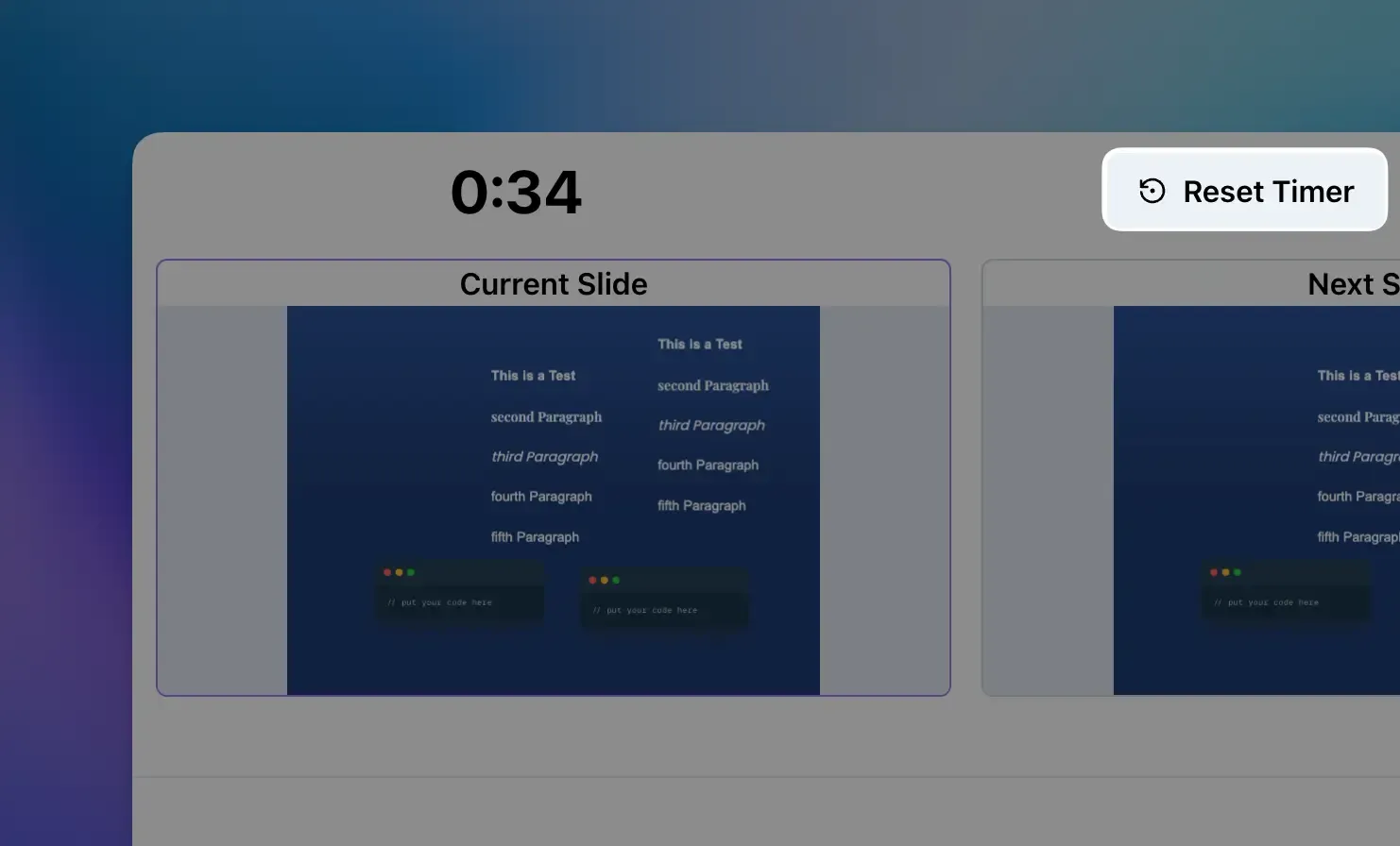
⏱️ Reset Timer in Presenter View
You can now reset the elapsed time in the presenter view with a single click. This is useful when you want to restart your timing, for example after a break or when rehearsing a specific section of your presentation.
See the latest product updates for snappify.
You can now reset the elapsed time in the presenter view with a single click. This is useful when you want to restart your timing, for example after a break or when rehearsing a specific section of your presentation.
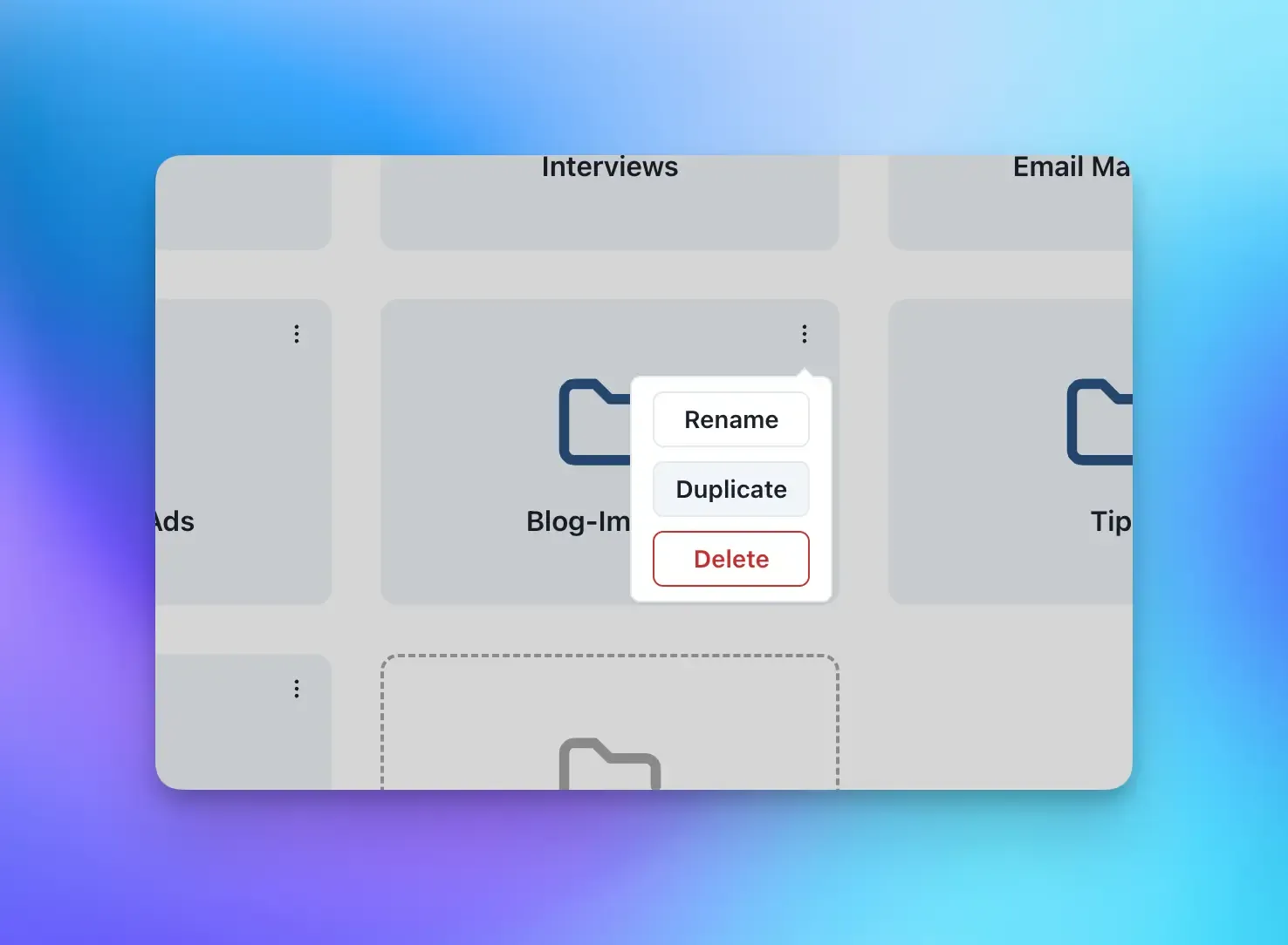
You can now duplicate entire folders along with all their contents recursively. This makes it easier to create copies of complex folder structures without having to manually recreate the hierarchy.
Simply click on the action menu of any folder and select “Duplicate” to create a complete copy including all nested folders and items.
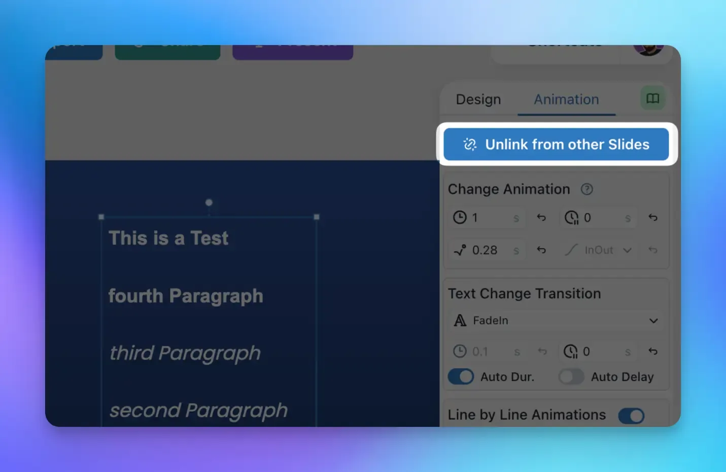
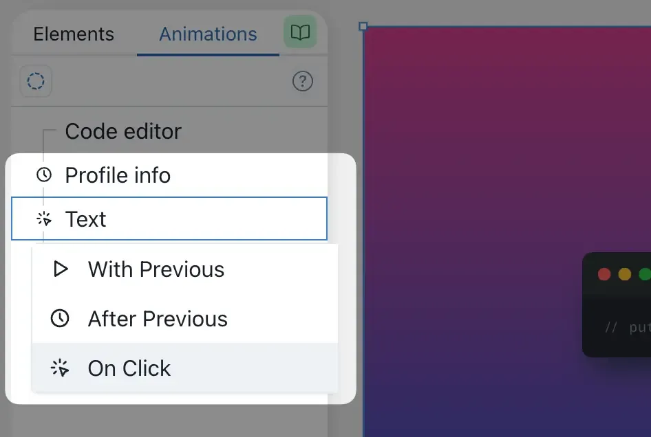
In snappify, elements are automatically linked to each other when you duplicate them. This is done to ensure that the elements transition smoothly when they are duplicated.
However, sometimes you may want to unlink an element from its instances on other Slides. For this we now introduced a new button on the Animation tab of the right toolbar:
The elapsed time is now displayed in the presenter view so that you can see how much time has passed during a presentation.
It’s now possible to animate text changes with different animation types like a Typewriter effect, SlideIn animations or Morphing changes.
Video showcasing the new text animation controls
Additionally it’s also possible to animate the text line-by-line on click during a presentation, so you don’t have to create several Slides for e.g. showing bullet-point lists line-by-line.
The change detection algorithm which is used to morph code changes has been improved. This will lead to more consistent and better looking code morphs as it now detects similarities better.
Video showcasing the new code morphing animation
We also published a new template which you can copy to see how to leverage the code morphin animation.
There’s a new feature to give you more control over your presentations! 🚀
It gives you the opportunity to let Slides automatically advance to the next Slide after all animations have finished playing and the Slide Duration has elapsed.
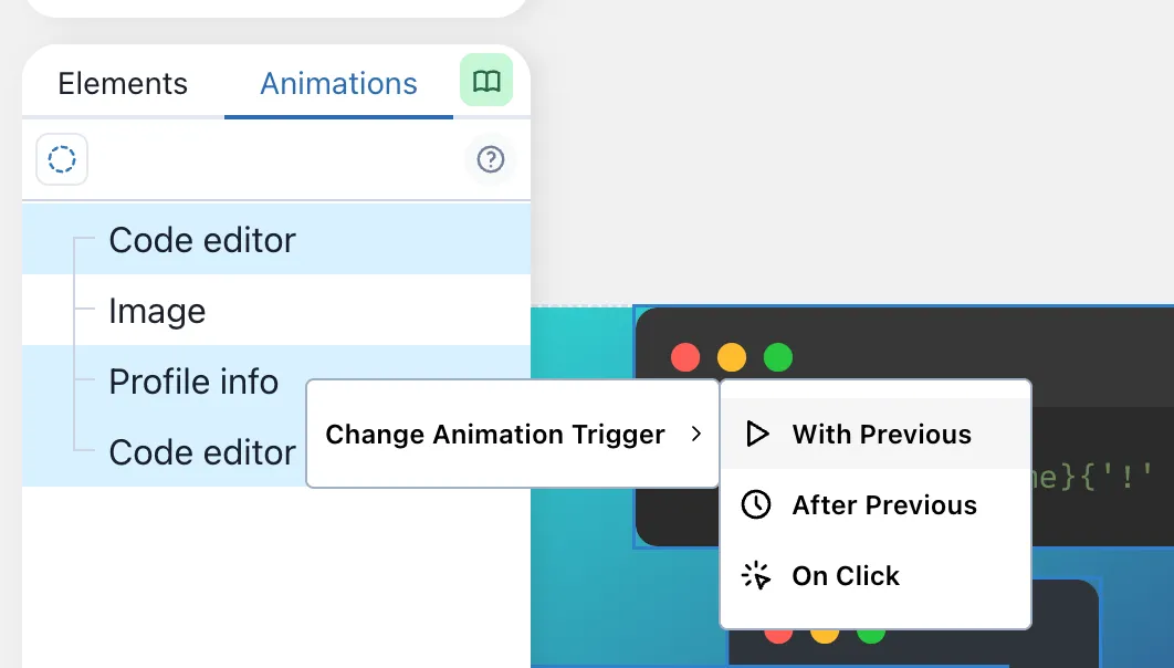
It’s now possible to bulk-edit animation triggers for multiple elements simultaneously.
On the left toolbar, when you’re in the “Animation” Tab, select multiple elements and open the context-menu via right-click, in order to change the Animation Trigger for all selected elements.
We’ve added a new context menu option that allows you to quickly copy elements as image to your clipboard!
Now you can easily:
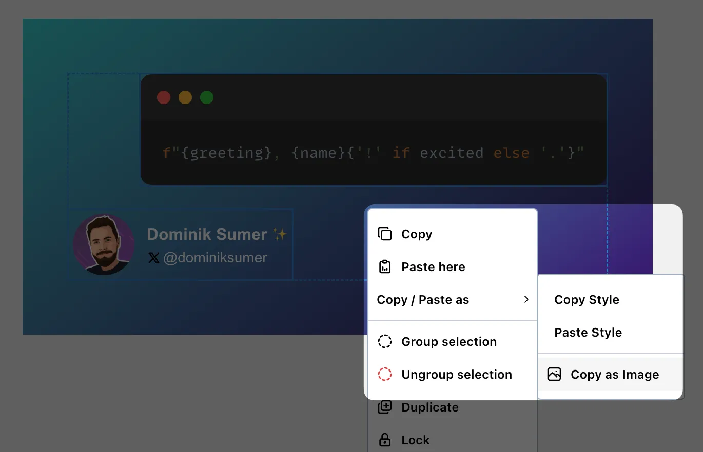
This feature is perfect for quickly sharing specific parts of your snaps without exporting the entire image.
It’s now possible to specify code highlights per line via the Simple Snap API 🥳
Video showcasing the new code highlights API
Happy to release an often requested feature: the ability to upload animated GIFs to your slides! 🎉
Video showcasing the Draw animations for arrows
They’ll also work in your exported videos 📺
I’m proud to announce another big Update for snappify 🥳
It’s now finally possible to specify the order of the animations on your Slides, as well as configure different triggers when animations should be fired.
Checkout the corresponding Docs for more infos!
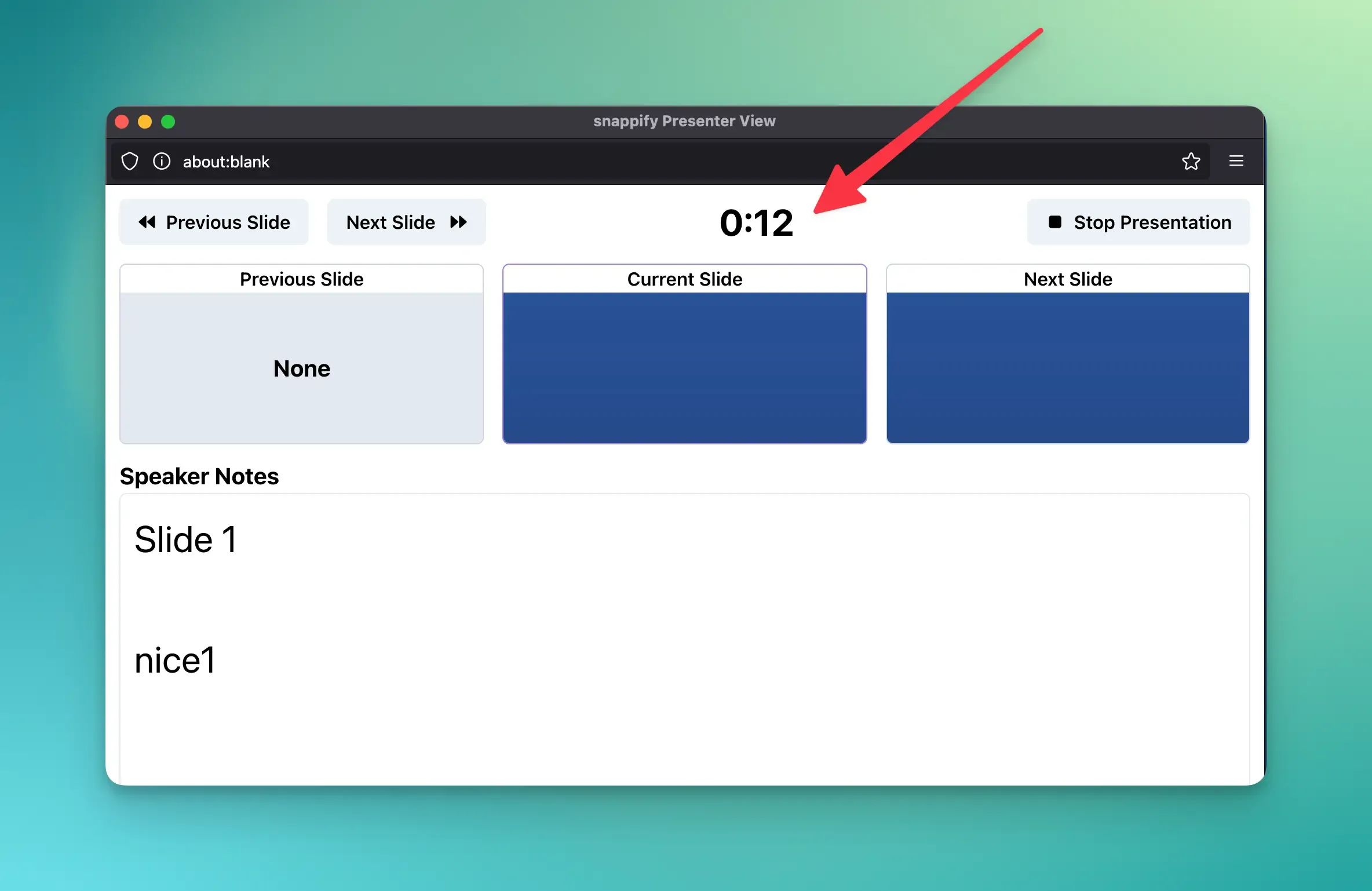
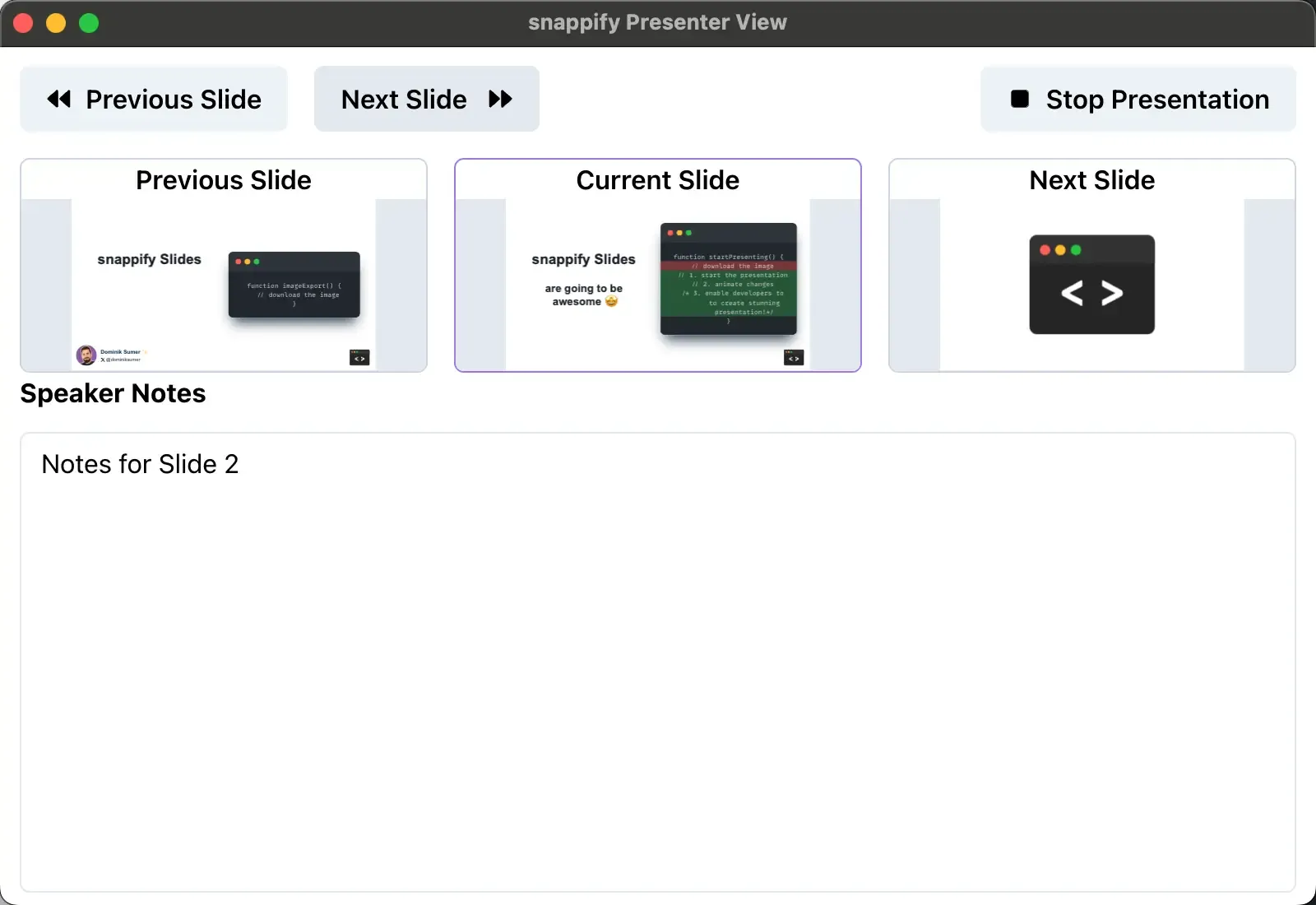
You’ll now see a preview of the previous, current and next slide in the Presenter View.
This will help you to better prepare for the upcoming slides and transitions during your presentations. 😄
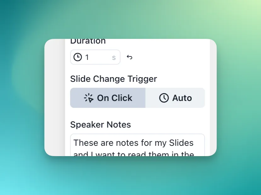
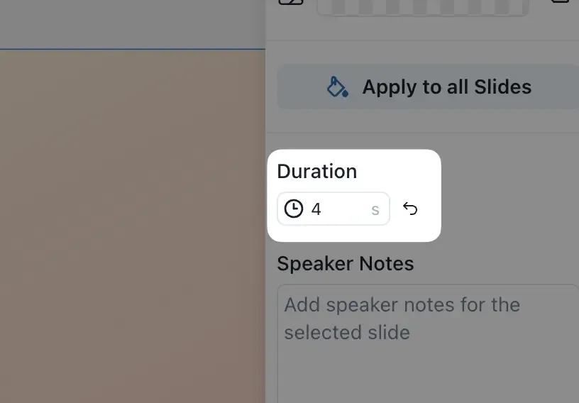
It’s now possible to configure the Duration of each Slide!
You can find the Setting to specify the duration of the selected Slide on the right toolbar:
You can now use they keyboard shortcut Ctrl +K to open the new Command Menu. All our favorite commands are now just a keystroke away.
If you’re missing a command in the menu, please reach out! 😄
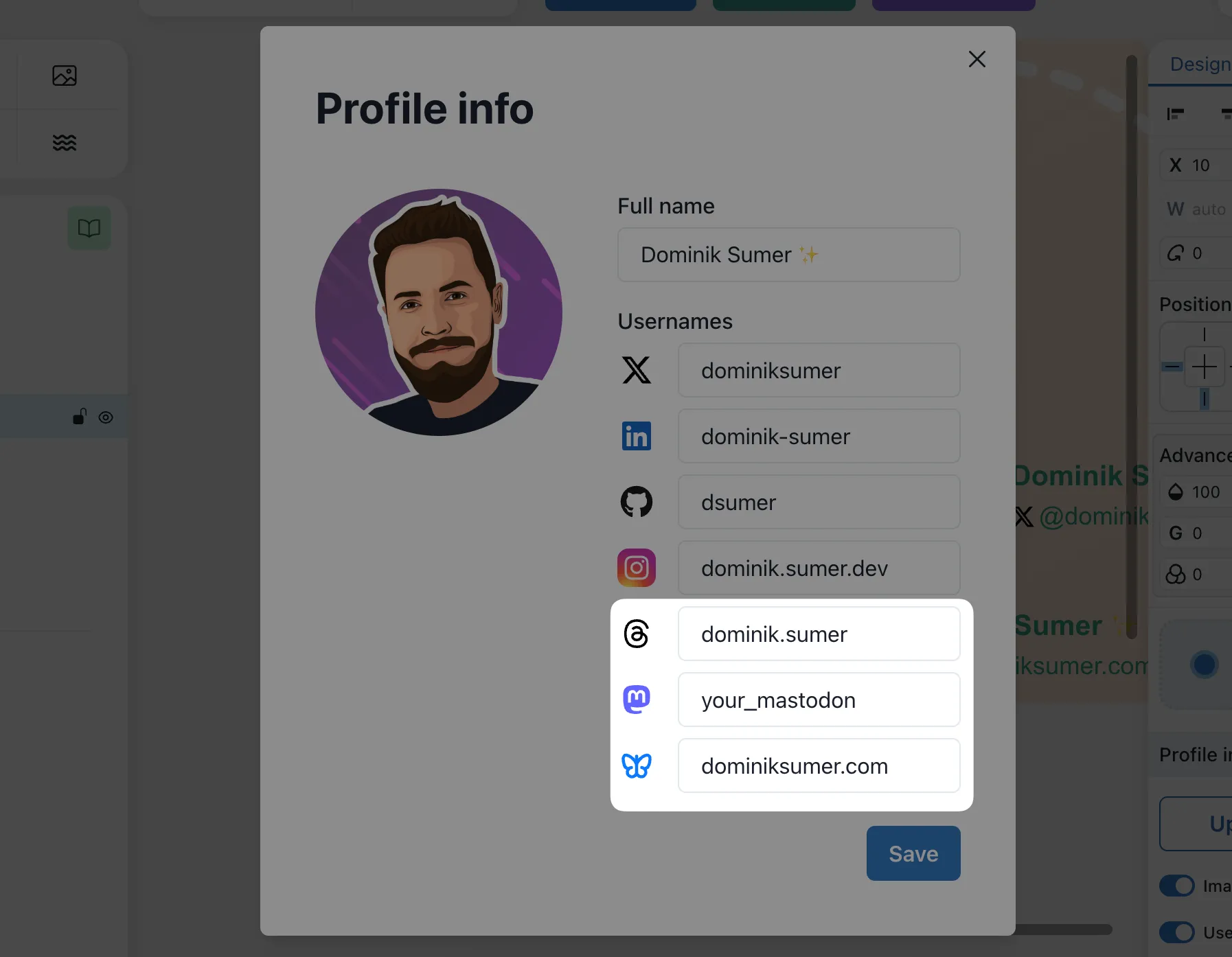
You’re now able to add your Threads, Mastodon and Bluesky accounts to your profile info elements. 🥳
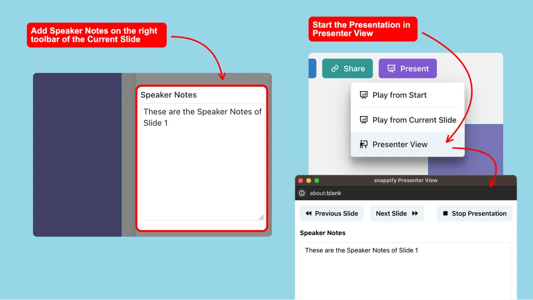
We’ve added the possibility to add Speaker Notes to your Slides. This allows you to add additional information to your Slides, which you can see throughout your presentation.
In order to view the Speaker Notes while presenting, start your Presentation in the Presenter View:
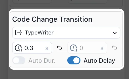
It’s now possible to specify the duration and delay for Code Changes.
This gives your even more flexibility to create the perfect transitions for your code changes, or to make them faster. 😄
For more infos, checkout the corresponding Docs.
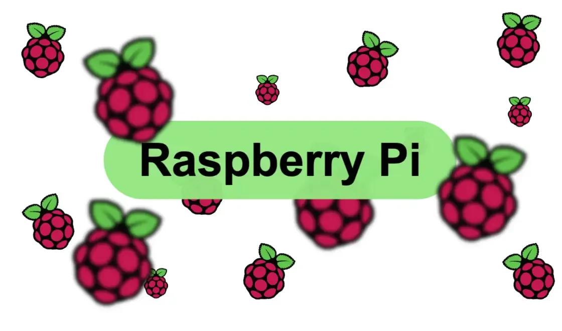
We’ve published a new template showcasing a parallax effect using the Raspberry Pi Logo 😄
Check it out 👇
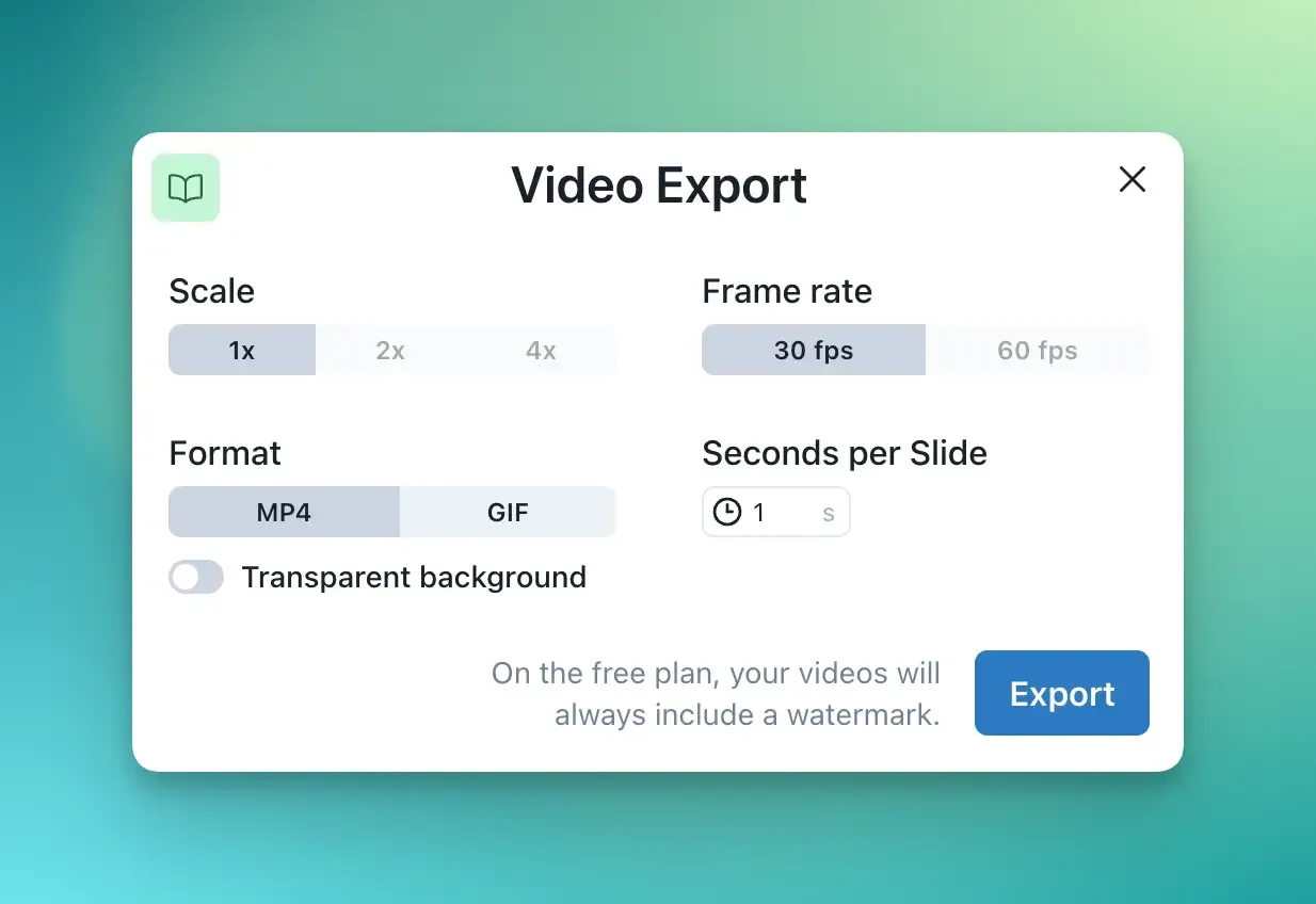
We’ve released new options for our Video Exports 🙌
You’re now able to define the Scale, FPS and Seconds per Slide. Additionally you can also export Videos with transparent backgrounds or export your Slides as GIF.
With this, our Desktop App is now also available for all major platforms!
Learn more in our new Documentation 😄
snappify will help you to create
stunning presentations and videos.