Why Code Screenshots Get More Engagement Than Plain Text
You have posted a code snippet as plain text before. It sat in the feed like every other wall of text, and it got two likes from people who probably didn’t read past line three.
Then you posted the same idea as a styled code screenshot.
Same logic, same language, same point you were trying to make. It got shared, saved, and replied to.
That is not luck. It is how feeds, brains, and code readability actually work.
Here is the short answer, the data behind it, and how to make screenshots that actually pull their weight.
The Short Answer
Code screenshots get more engagement than plain text because of a few compounding factors:
- Platforms don’t render code well: X, LinkedIn, and Instagram strip monospace formatting, indentation, and syntax highlighting from pasted text, so a 10-line function turns into an unreadable wall of characters.
- Images stop the scroll: Feed algorithms and human attention both favor visual breaks over dense paragraphs.
- Syntax-highlighted code is genuinely easier to read: Eye-tracking research backs this up, not just design opinion.
- Visual formats consistently outperform text-only posts across LinkedIn, X, and other platforms, according to multiple large-scale engagement studies.
- A well-designed screenshot signals effort and credibility, which matters more with a technical audience that can spot a lazy post instantly.
Now let’s look at what the numbers actually say.
What the Engagement Data Actually Shows
LinkedIn: visual formats dominate the feed
LinkedIn is where a huge share of developer content, technical marketing, and “build in public” posts now live, and the platform’s own performance data makes the pattern obvious. According to Socialinsider’s 2026 LinkedIn benchmarks, based on an analysis of 1.3 million business posts, native document and carousel formats lead engagement at around 6.6 to 7 percent, while plain text-only posts sit closer to 3.95 percent, roughly half the rate.
Even simple image posts consistently beat text.
A separate analysis of nearly 500,000 LinkedIn posts with synced analytics found that image posts convert 3.10 percent of viewers into a like or comment, ahead of video and carousels when measured against impressions rather than raw follower count.
X (Twitter): the algorithm rewards what stops the scroll
X’s recommendation system decides whether to keep pushing a post to more people based largely on how quickly it earns replies and reposts after going live.
According to a breakdown of how the X algorithm works in 2026, visual posts, including screenshots with useful insights, simple charts, or short clips, tend to catch attention and stop the scroll faster than a plain block of text, which increases the odds of triggering that early engagement signal the algorithm is watching for.
The wider pattern: images and visuals win across platforms
This isn’t a LinkedIn- or X-only phenomenon. SocialBee’s 2026 social media report, based on an analysis of over 9.3 million posts published in 2025, found that image posts alone account for 44.8 percent of all high-engagement content, and that images plus carousels together make up nearly 60 percent of top-performing posts across the ten platforms studied.
Buffer’s 2026 State of Social Media Engagement report, which analyzed more than 52 million posts, found similar reinforcement: visual and interactive formats consistently pull more reactions and replies than plain text, across nearly every platform they tracked.
So when you’re wondering whether code images get more engagement, it’s a fair question: the answer is that it’s not a small edge.
It is a structural advantage baked into how modern feeds rank and display content.
Why Screenshots Beat Plain Text: The Psychology and the Rendering Problem
There are two separate reasons this happens, and it’s worth separating them because they call for different fixes.
Reason 1: Plain text code genuinely breaks on social platforms
This part isn’t psychology; it’s just a rendering limitation.
X, LinkedIn, Instagram, and most social feeds don’t support monospace fonts or syntax color.
When you paste a code snippet as plain text:
- Indentation collapses, so nested logic becomes unreadable
- There’s no color differentiation between keywords, strings, and comments
- Special characters sometimes get mangled entirely depending on the client
A screenshot sidesteps all of this.
It renders identically whether someone views it in a feed, a DM, a Slack thread, or a presentation slide, because it’s an image, not text waiting to be interpreted by a platform’s formatting engine.
Reason 2: Visual information is genuinely easier and faster to process
This is where the psychology comes in, and it’s worth being precise about it because a lot of marketing content overstates the science.
The well-documented picture superiority effect, first demonstrated by psychologist Allan Paivio in the early 1970s, shows that people consistently recall and process visual information more easily than plain verbal information.
This effect has been replicated across decades of memory research.
For code specifically, the evidence is more direct.
A peer-reviewed eye-tracking study published in the Journal of Eye Movement Research measured how student programmers read code with and without syntax highlighting.
The result: fixation counts, fixation durations, and regressions (where the eye jumps back to re-read something) were all measurably higher when reading code without color highlighting.
In plain terms, unhighlighted code takes more visual effort and more backtracking to understand, even for people trained to read it.
That’s the real mechanism behind code snippet vs plain text engagement. It’s not that people are shallow or won’t read text.
Syntax-highlighted, well-formatted code is objectively less cognitively expensive to parse, so people are more likely to finish reading it and then react to it.
What Actually Makes a Code Screenshot Convert Attention Into Engagement
Not every code screenshot performs well.
A blurry terminal screenshot with default syntax colors and a cluttered browser window in the background is still a screenshot, but it won’t get the engagement lift described above.
Here’s what separates a screenshot that gets scrolled past from one that gets saved and shared.
Keep the snippet short:
Somewhere between 8 and 15 lines is the sweet spot for social feeds.
Anyone can decide whether to engage within a couple of seconds, and a wall of code, even a beautiful one, asks for more attention than most scrollers will give it.
For longer examples, multi-window code comparisons let you show a before/after or a diff without cramming everything into one giant block.
Use real syntax highlighting, not a generic monospace font:
This is the single biggest lever, directly backed by the eye-tracking research above. A proper theme with distinct colors for keywords, strings, functions, and comments cuts down the cognitive load needed to parse the snippet.
Add context directly on the image:
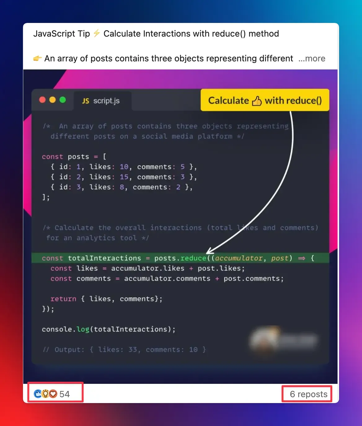
The best-performing code screenshots don’t just show code; they explain it. Arrows pointing at the interesting line, a short annotation calling out why a piece of logic matters, or a highlighted section that dims everything else all help a viewer understand the point in the first two seconds, without needing to read every character.
Keep your branding consistent:
A recognizable theme, a consistent window style, and your handle or avatar in the corner turn a one-off screenshot into part of a recognizable content series, which matters a lot for building a following as a developer rather than posting one-off content that never compounds.
Match the format to the platform:
A tall, narrow screenshot gets cropped awkwardly in a feed. A wide, landscape-oriented image with generous padding around the code holds up better across X, LinkedIn, and Slack previews alike.
If you’re doing this by hand in a screenshot tool and a design app every time, it adds up fast.
This is exactly the gap dedicated code-to-image converters close, since they combine syntax highlighting, theming, and layout in one pass instead of stitching together a screenshot tool and an image editor.
How to Start Creating Screenshots That Actually Perform
You don’t need design skills to fix most of the mistakes above.
Snappify was built specifically for this: a design tool that lets developers add syntax-highlighted code, annotations, arrows, and consistent branding without opening a separate image editor.
You can start directly in the free editor, pick from ready-made templates built for social media and presentations, or install the VS Code extension to generate a snap without leaving your editor.
If you’re producing content regularly rather than the occasional one-off post, it’s worth building this into your workflow the same way you’d plan any other part of your developer content strategy, so every snippet you share looks intentional instead of thrown together at the last minute.
FAQs:
Should I take a regular screenshot, or use a dedicated tool?
A regular screenshot fixes the platform rendering problem but usually looks inconsistent, has poor contrast, and includes distracting IDE clutter. A dedicated code to image tool adds proper theming, cropping, annotations, and consistent branding, which is what separates a screenshot people scroll past from one they stop for.
Should I put a logo or watermark on every code screenshot?
It depends on the goal. If you’re building a recognizable personal or company presence, a small, consistent avatar or handle in the corner helps people recognize your content as they scroll. It also helps protect against screenshots getting reposted without credit.