
5 Best React Component Libraries for Quick Development in 2024
React component libraries are pre-built collections of reusable UI components that help developers create consistent and visually appealing user interfaces for their React projects.
These libraries offer many components, such as:
- Buttons
- Forms
- Carousel
- Navigation bars
- Accordion
- Alerts
- Badge
- Breadcrumb and more
You can easily integrate them into the project’s codebase.
Choosing the right React component library is essential for the success of a project as it can significantly accelerate software development, improve the overall user experience, and ensure a consistent design language across the application.
With numerous options available, developers must compare the best React component libraries to make an informed decision.
5 Best React Component Libraries:
We have carefully selected these component libraries to ensure a better, faster, and easier development experience.
These libraries have everything from stylish UI elements to powerful data visualization components.
So, let’s dive into the world of the best component libraries for React and take your React projects to the next level.
Material-UI
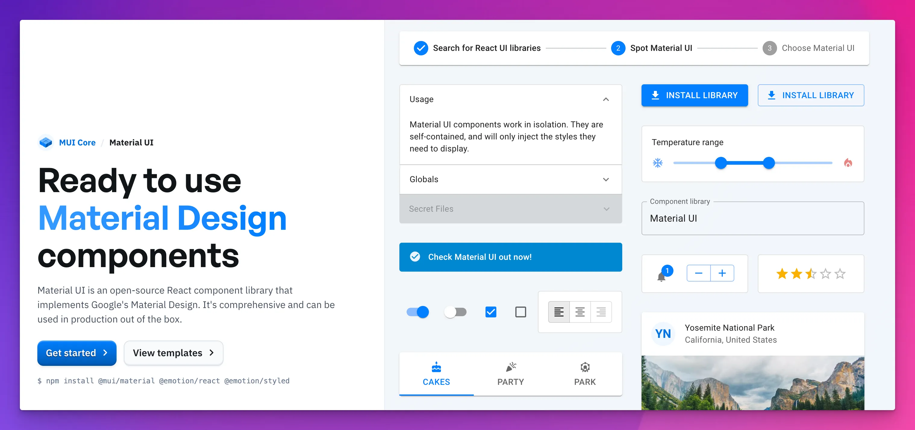
Material-UI is one of the most popular React component libraries, known for implementing Google’s Material Design.
It offers a wide range of customizable and accessible components that stick to the Material Design guidelines, making it suitable for creating modern and visually appealing user interfaces.
Key features:
- 40+ rich sets of components, including buttons, icons, alerts, tables, tooltips, and banners.
- Customizable themes and styles to match the project’s design language (Design System)
- Strong community support and active development
- Comprehensive documentation and easy integration with React applications
- Used by over 1 million developers
- 2899+ contributors at GitHub
Use Cases:
- Dashboard and data visualization applications
- Enterprise applications with complex UI requirements
- Projects that require adherence to Material Design principles
Chakra UI
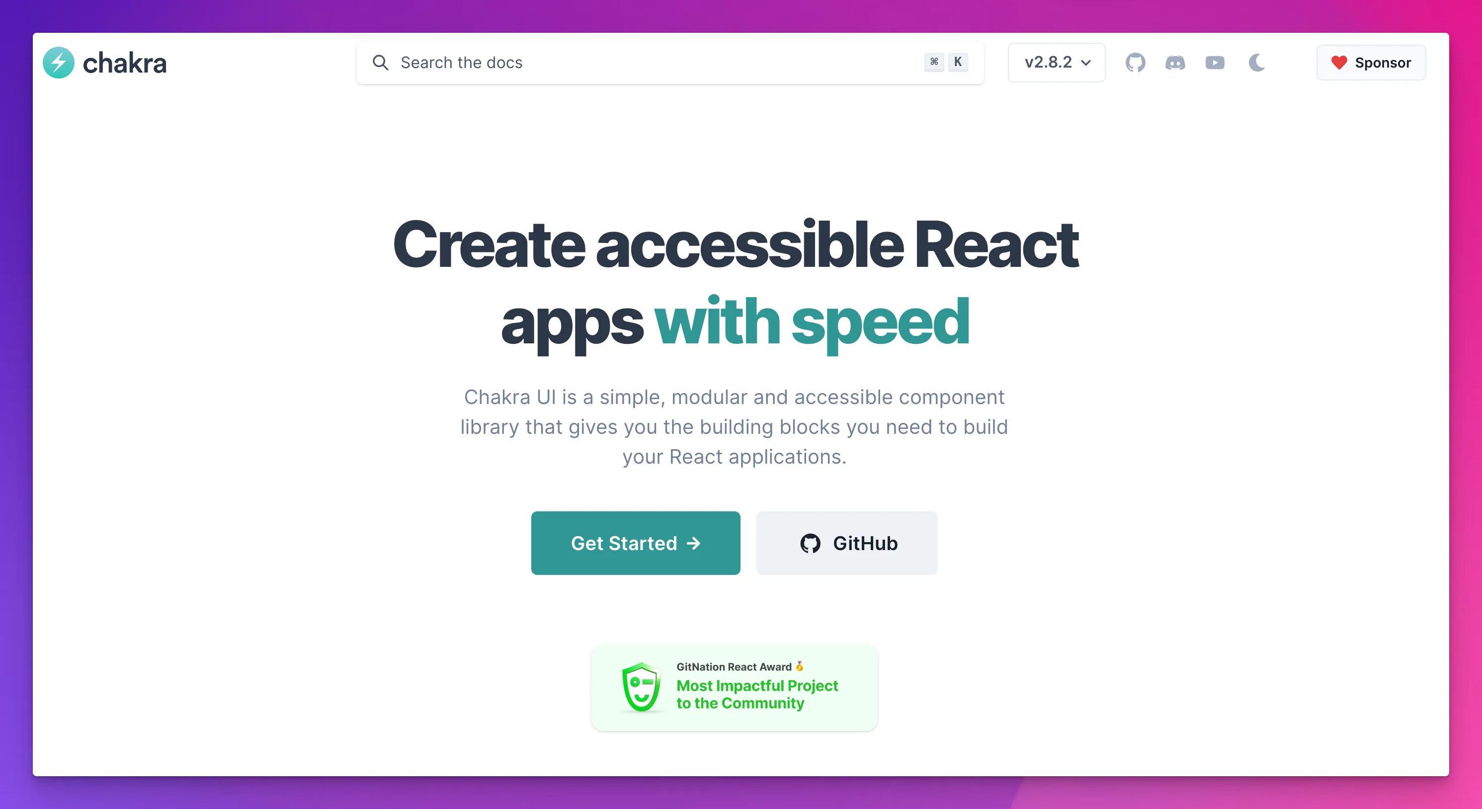
Chakra UI is a simple, modular, and accessible component library that provides a set of composable and customizable components for building React applications.
It focuses on developer experience and allows easy customization to match the project’s design requirements.
Key features:
- Modular and composable components for flexibility in design
- Built-in support for dark mode and color modes
- Accessibility and internationalization features out of the box
- Emphasis on developer experience and ease of use
- Used by over 247k developers
- 621+ contributors at GitHub
Use Cases:
- Prototyping and rapid application development
- Projects with a focus on accessibility and inclusivity
- Custom design requirements with a need for flexibility in component styling
Tip: Snappify, a tool that generates beautiful code snippets, also uses Chakra UI.
Ant Design
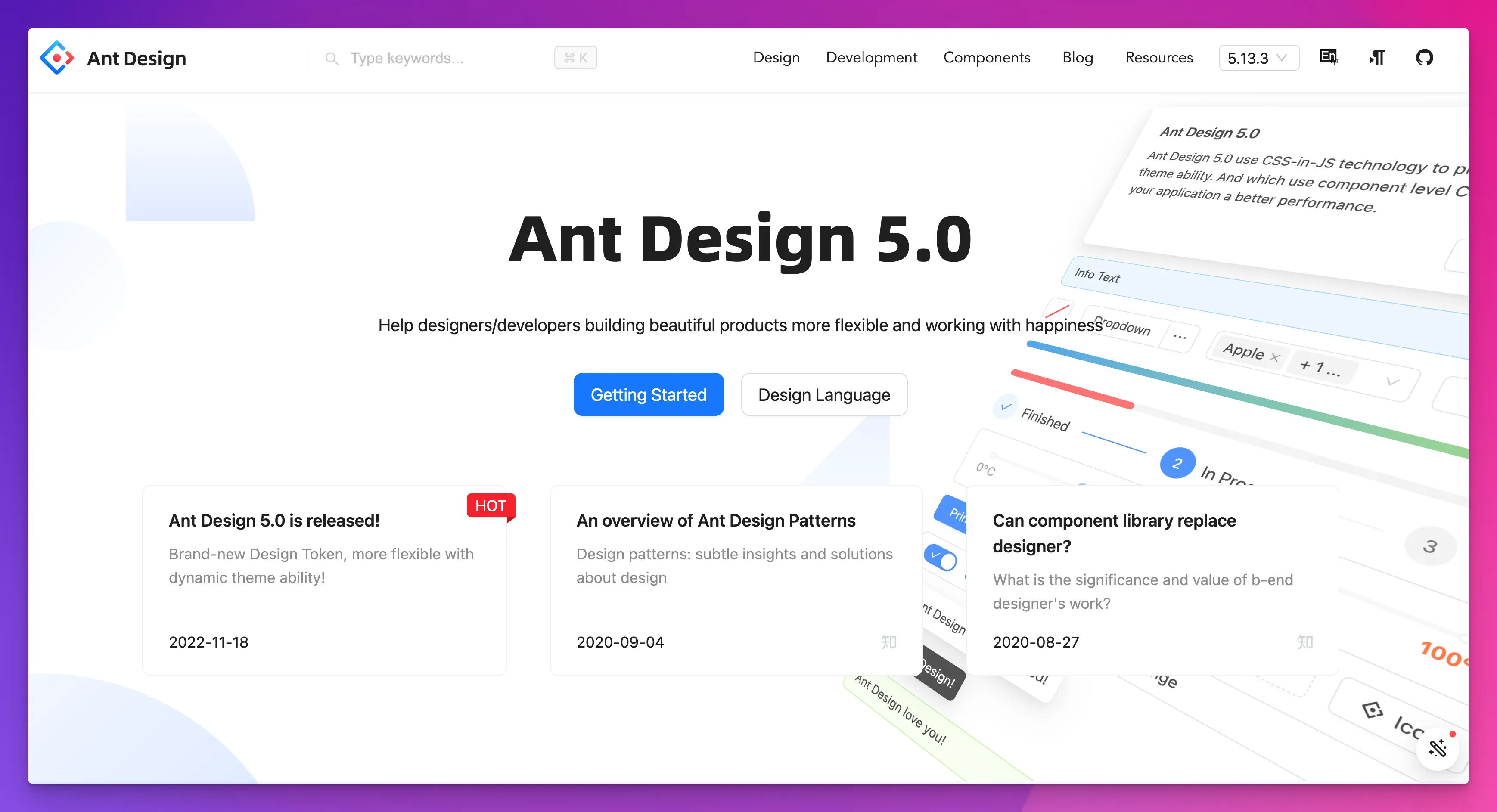
Ant Design is a design language and React UI library that provides a set of high-quality React components out of the box.
It is known for its enterprise-level design and extensive component library, making it suitable for building professional and feature-rich applications.
Key features:
- Enterprise-level design language with a focus on usability and consistency
- A comprehensive set of components for building complex interfaces
- Built-in support for internationalization and accessibility
- Active community and regular updates
- Used by over 538k developers
- 2054+ contributors at GitHub
Use Cases:
- Corporate and business applications
- Management systems and admin panels
- Projects requiring extensive form components and data visualization
Shadcn UI
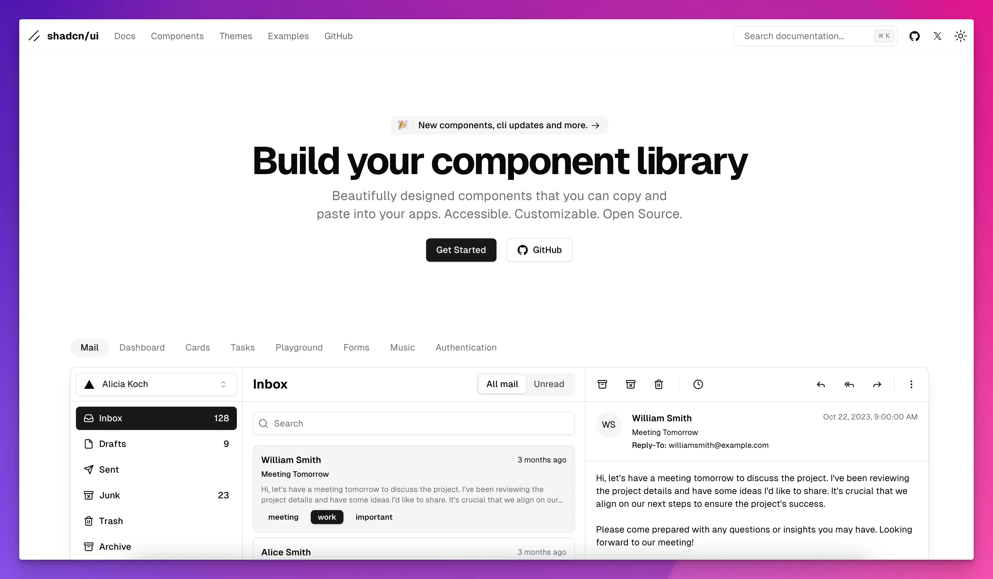
Shadcn UI is a new but fastest-growing React component library that offers a versatile set of components designed to integrate smoothly into your React applications.
With its focus on customization and modern design standards, it aims to provide developers with the tools they need to create visually appealing and accessible user interfaces.
Key features:
- It offers various pre-built components, including accordions, buttons, forms, and more.
- Customizable themes allow developers to match the design language of their projects.
- Emphasizes accessibility with well-structured components and proper labeling.
- Comprehensive documentation and examples make it easy for developers to get started.
- Growing community support indicates its potential as a go-to solution for React developers.
- Released on March 8, 2023
- Used by over 2.6k developers
- 180+ contributors at GitHub
Use Cases:
- Modern and visually appealing dashboards
- Enterprise applications with complex UI requirements.
- Projects that prioritize compliance with design standards and accessibility guidelines.
Note:
Although Shadcn UI may not be as popular as established libraries like Material-UI, it is gaining recognition among React developers for its high-quality design and customization options.
As it continues to evolve and attract more contributors, it has the potential to become a valuable tool for those seeking to enhance their React applications with a polished and user-friendly interface.
Semantic UI React
Semantic UI React is a popular React UI library that provides a set of themable React components based on the Semantic UI design language.
It offers various components and behaviors, making it suitable for creating visually appealing and responsive user interfaces.
Key features:
- Components with a focus on consistent design language
- Responsive and mobile-friendly components for cross-device compatibility
- Extensive documentation and theming capabilities
- Active community and frequent updates
- Used by over 185k developers
- 329+ contributors at GitHub
Use Cases:
- Consumer-facing web applications
- Projects requiring a visually appealing and responsive design
- Rapid prototyping and development with themeable components
Other Popular React Component Libraries:
You can explore and implement many options in your Reactjs projects, but below are some other popular React UI libraries you should look into:
- Next UI
- Blueprint UI (React-based toolkit)
- Headless UI
Final Words:
In short, React component libraries offer unique features and benefits for different projects. To choose the best library, consider design language, component flexibility, theming, and community support.
Did you like this developer insight, make sure to check our other recent guides:
- Boost coding experience with the best vscode themes
- Our top picks of best JavaScript frameworks
FAQs:
What is the most used React package?
Redux is one of the most commonly used React packages for state management, while Material-UI is popular for its ready-to-use UI components.
What are the best UI component libraries for complex form building in React?
Use libraries like Material UI and Blueprint UI to build complex forms. They offer ready-to-use components such as input fields, dropdowns, and checkboxes to handle complex form requirements.
What are the benefits of Headless UI?
Headless UI is an unstyled but accessible collection of UI components for React. It allows freedom in designing and customizing components while maintaining user accessibility.
Why do UI component libraries use React Hooks?
Many React UI component libraries utilize hooks for managing component states and creating complex components. Hooks offer a more direct API, leading to cleaner and more readable code.