10 Best Tailwind CSS Alternatives: Every Developer Should Know (2024)
Tailwind CSS is a powerful utility-first CSS framework that allows developers to create responsive websites.
Its ready-to-use utility classes and customization capabilities make styling easier and help design interfaces that work well on different devices.
However, while many developers love the simplicity and speed of Tailwind, it is not for everyone.
Its strict structure and class names can make customization tricky and clutter your HTML markup, leading to a learning curve.
Luckily, there are some great alternatives that you can consider, each offering unique features to fit your specific requirements.
This guide will outline the best Tailwind CSS alternatives for developers who want quick flexibility without any limitations.
Let’s get started.
snappify will help you to create
stunning presentations and videos.
10 Best Tailwind CSS Alternatives
Here’s an overview of the top Tailwind CSS alternatives that offer different styling options and easier customization to help you build beautiful, responsive designs.
Bootstrap
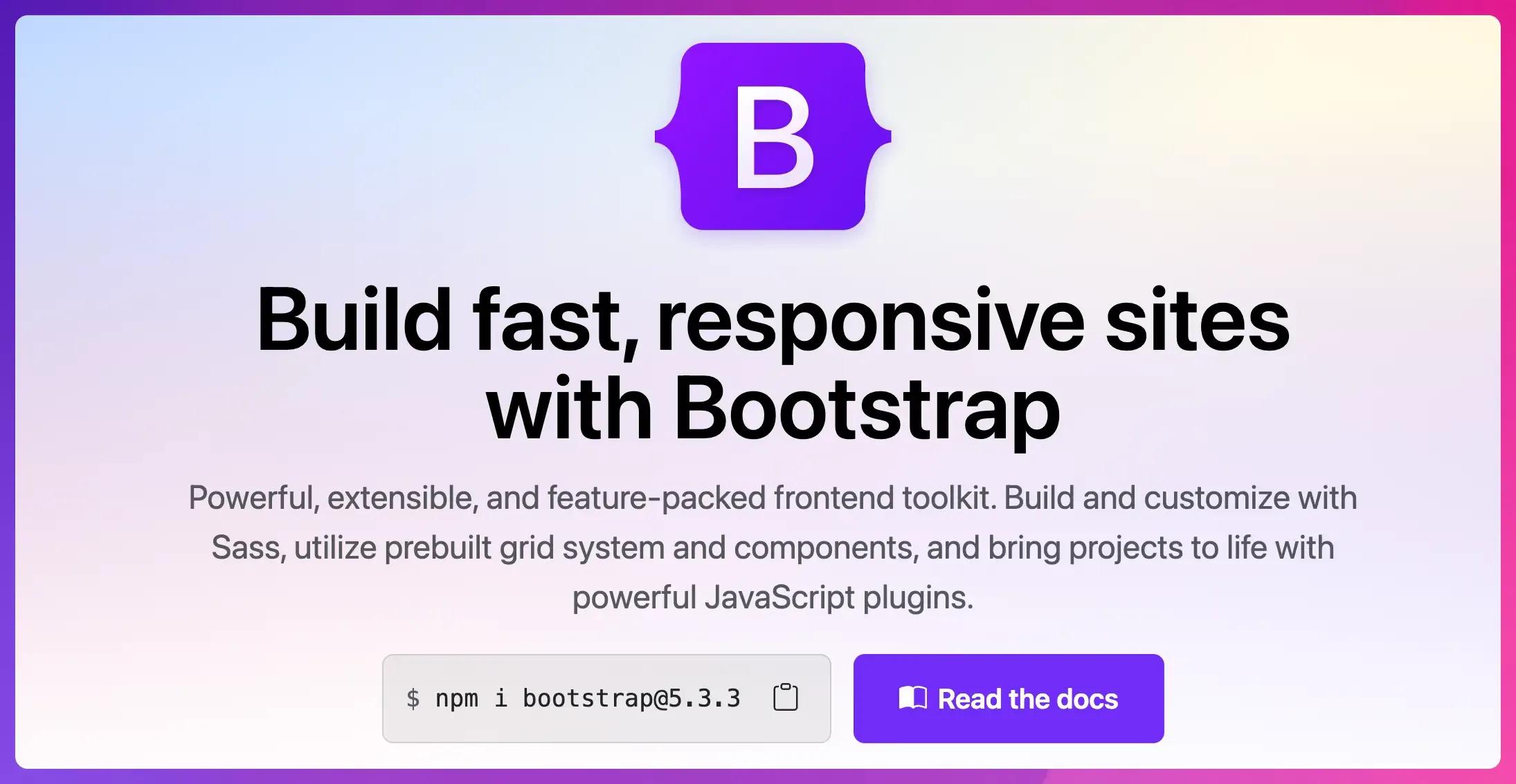
Bootstrap is one of the most popular CSS frameworks for building responsive, mobile-first websites and applications.
It is an open-source framework with a responsive grid structure and a large collection of ready-to-use HTML, CSS, and JavaScript components.
Bootstrap’s flexibility and extensive library of themes, templates, and built-in JavaScript plugins make it a great choice for new and experienced developers.
Key Features:
- Grid system for responsive layouts.
- Pre-styled components include buttons, forms, modals, navigation bars, and more.
- Strong community support and documentation.
- SASS integration to use only the CSS you need.
- Consistent updates and resources.
Pros:
- Reliable and widely used.
- Consistent design and scalability for large projects
- Rapid prototyping.
Cons:
- Steep learning curve.
- Limited flexibility in component styling.
Foundation
Foundation is a responsive front-end framework that offers flexibility to create layouts that adjust across different screen sizes and devices.
Its modular structure is built around a responsive grid system, which allows for advanced layouts and interactive websites.
It emphasizes customizability and scalability to give developers more design freedom to create functional and user-friendly websites.
Key Features:
- Pre-built library of UI components, including navigation menus, buttons, forms, cards, and more.
- Advanced customization with SASS and Flexbox.
- Accessibility features to create inclusive designs.
- Detailed documentation and community support.
Pros:
- Highly customizable with a focus on accessibility.
- Suitable for complex layouts and large-scale applications.
- Modular structure keeps code lightweight.
- Quick prototyping capabilities.
Cons:
- Steep learning curve.
- The community is not as large as Bootstrap or Tailwind.
Material UI
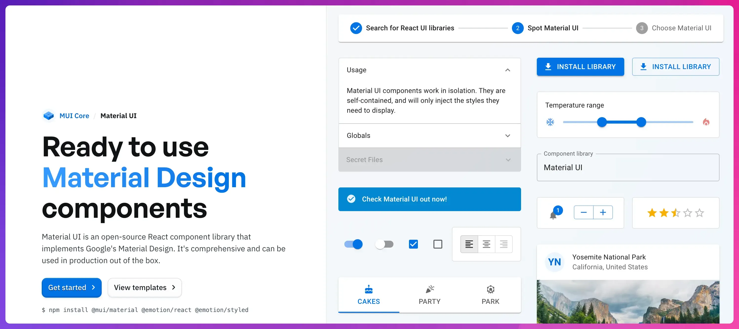
Material UI is a popular open-source library using Google’s Material Design to build responsive React applications.
It offers reusable components and tools for styling, theming, and responsive design that help developers build consistent user interfaces with a structured aesthetic.
Key Features:
- Comprehensive component library including buttons, forms, navigation bars, text fields, tables, and more.
- Easy to implement and highly customizable.
- Custom theming to reflect your brand’s unique identity.
- CSS utilities such as breakpoints, grids, and hidden components.
- Detailed documentation, examples, and resources support.
Pros:
- Consistent design language.
- Fast development of React applications.
- Easy to use for developers familiar with Material Design.
- Extensive resources to help speed up the learning process.
Cons:
- Advanced customization requires familiarity with React.
- Limited flexibility beyond Material Design.
Bulma
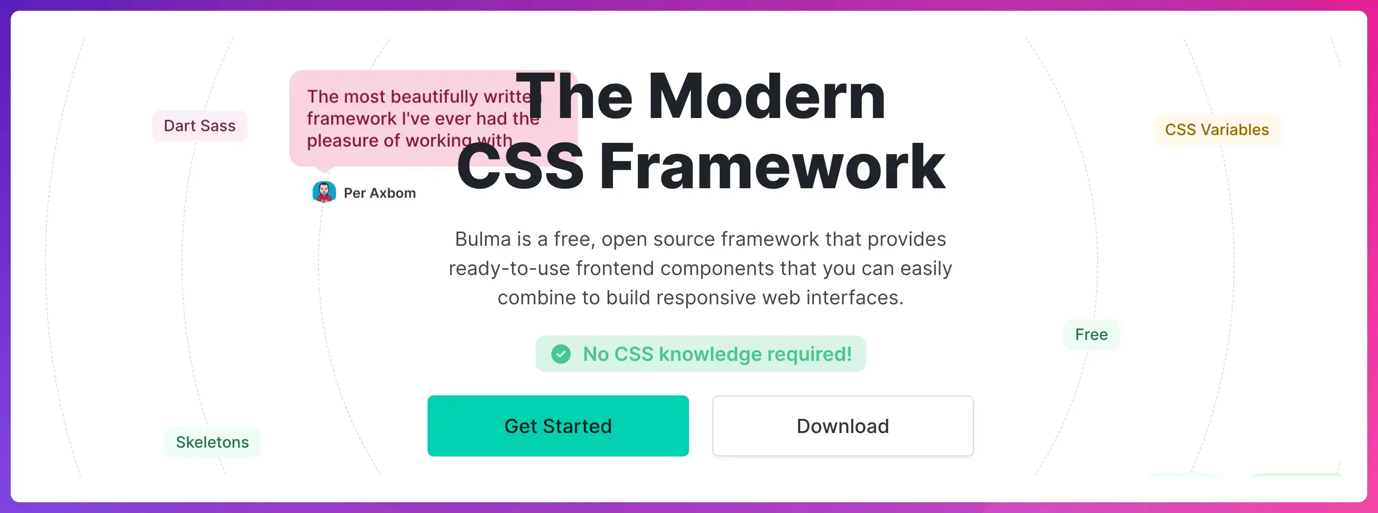
Bulma is a modern CSS framework known for its lightweight design and ease of use.
It provides a set of modular, ready-to-use components that make it easier to build responsive web interfaces without requiring knowledge of CSS.
Its grid-based system is built on Flexbox and comes with a wide range of SASS variables that allow developers to build responsive websites and adjust colors, spacing, and other design attributes.
Key Features:
- Flexbox-based grid system.
- Modular design allows you to add only what you need.
- UI component library for different use cases.
- SASS support for easy modification and customizing.
- Clean and easy-to-learn syntax.
Pros:
- Lightweight alternative to other frameworks.
- Simple, responsive layouts and rapid prototyping.
- Easy to use with minimal setup.
- There is no JavaScript requirement.
Cons:
- Less pre-built components compared to other frameworks.
- It’s not as customizable as Tailwind or Bootstrap.
Semantic UI

Semantic UI is a simple, user-friendly front-end framework that helps developers build stunning, responsive web applications with minimal effort.
Unlike other CSS frameworks, Semantic UI focuses on code readability and maintainability.
It also integrates with various JavaScript libraries, such as React, Angular, Meteor, and Ember, which makes it suitable for complex, interactive applications.
Key Features:
- Human-friendly HTML and class-based syntax using natural language.
- Built-in themes for easy customization.
- Extensive collection of components.
- Modular structure to improve load times and performance.
- Comprehensive documentation and support.
Pros:
- Readable class names for easy styling.
- Easy to use and customize.
- Easy prototyping and development.
Cons:
- It is relatively heavy and requires more configuration.
- Class names may be longer compared to Tailwind CSS.
Chakra UI
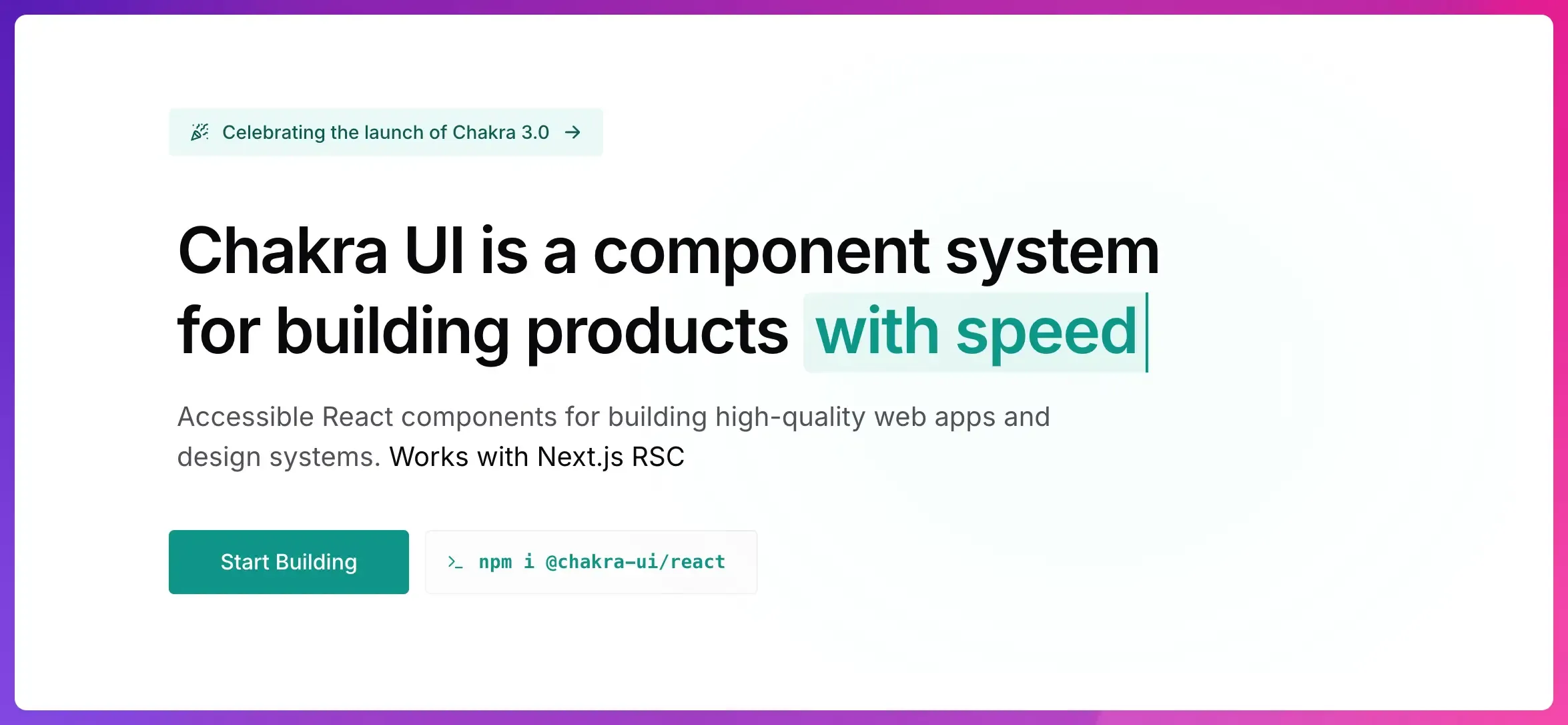
Chakra UI is a component library specifically designed for React applications.
It prioritizes accessibility, performance, and developer experience and provides React components that are easily styled to meet different design requirements.
Its design system approach allows developers to apply design principles and consistently integrate their branding.
Key Features:
- Accessible and modern React component library.
- Customizable theming and dark mode support.
- Responsive design utilities.
- TypeScript support with type definitions for each component.
- Prop-based styling to improve readability.
- Active community and documentation.
Pros:
- Great for projects using React.
- Easily customizable and extensible.
- Focuses on accessibility and theme support.
Cons:
- Limited to React-based projects.
- It is not suitable for other JavaScript frameworks.
UIKit
UIKit is a modular and feature-rich CSS framework for building responsive and modern websites.
It offers a minimalistic design with a complete toolkit for developing clean, visually appealing, and user-friendly websites.
Key Features:
- Modular JavaScript components that can be individually imported.
- Grid layout system with responsive design.
- Built-in animations and customization options
- Works with popular frameworks like Vue.js and React.
- Supports theming through Sass and Less.
Pros:
- Comprehensive components for flexible design.
- Active community support and documentation.
Cons:
- Smaller community compared to Tailwind or Bootstrap.
- Limited resources and built-in themes.
Pure CSS
Pure CSS is a lightweight CSS framework that provides essential components and utilities for building modern web applications.
It is composed entirely of CSS without any JavaScript components, making it highly performant and easy to integrate with any JavaScript framework.
Key Features:
- Optimized for mobile-first design.
- Individual responsive modules that are easy to pick and choose.
- Minimalistic design for quick styling.
- It can be extended with custom CSS classes.
- Flexible grid system to create layouts for any screen size.
- Consistent class naming convention for maintainability.
Pros:
- Very lightweight with minimal styles.
- Faster loading due to smaller file sizes.
- Ideal for performance-focused projects.
Cons:
- Limited styling options.
- Not suitable for complex UI elements or large projects
Cirrus
Cirrus is a component-and-utility-centric CSS framework for building modern interfaces quickly.
It is built to be lightweight, modular, and easy to use, with a wide range of utility classes and components for building clean layouts.
Key Features:
- Beautifully designed pre-built components.
- Responsive design utilities and flexible grid system.
- Built-in animations and transitions to add dynamic elements.
- Modify existing component styles or add new utility classes.
- Organized documentation with examples.
Pros:
- Clean syntax with simple structure.
- It can be customized and extended.
- Accessibility features for creating inclusive designs.
Cons:
- Limited component library and customization choices.
- There is no built-in theming support.
- Smaller user base and community support compared to more popular options.
UnoCSS
UnoCSS is a utility-first CSS framework that offers an on-demand atomic CSS approach.
Unlike Tailwind, UnoCSS does not provide predefined utility classes.
Instead, it generates CSS only for the classes used in the project.
You can define custom rules and create your own conventions and design system.
This makes UnoCSS extremely fast and performance-optimized, as it significantly reduces the overall CSS file size.
Key Features:
- Highly customizable and extensible.
- On-demand CSS class generation.
- Generates styles at build-time.
- Just-in-time (JIT) compilation.
- Dynamic utilities and variants for responsive design.
Pros:
- Generate only necessary CSS.
- No impact on runtime performance.
- Supports all major frontend frameworks.
Cons:
- Learning curve for beginners.
- Smaller ecosystem compared to Tailwind.
snappify will help you to create
stunning presentations and videos.
Final Words
While Tailwind CSS is a powerful tool loved by many developers, these alternatives allow you to adapt your styling approach to fit your project’s needs and preferences.
Each tool has unique strengths and features, making it suitable for different projects.
Instead of settling for a framework that does not fit your workflow, choose one that best suits your style.
If you like this article, check out our analysis on:
FAQs:
Which is better, Tailwind or Bootstrap?
Tailwind offers more customization and creative control for unique designs, while Bootstrap provides a faster development experience with ready-made components.
Which Tailwind alternative is best for beginners?
Bootstrap is often the best option for beginners because it offers ready-to-use components, a simple grid system, and detailed documentation that makes it easy to start quickly.
Can you use SASS with Tailwind?
You can use SASS with Tailwind by combining SASS’s nesting and variables with Tailwind’s utility classes in your project’s stylesheet.
