13 Best Fonts for Coding: Optimize Your Workflow Today (2025)
Do you feel your eyes strain after long coding sessions?
Many developers experience poor reading and frequent errors when their chosen font results in tiny gaps between characters.
You can adjust the brightness of your screen or get stronger glasses, but the underlying cause is still hidden in your font settings.
Every misread parenthesis or misplaced semicolon interrupts your thought flow and results in extra debugging time.
Choosing the correct programming font can improve readability, lessen eye strain, and even help you write code faster.
This guide will help you find the best fonts to optimize your coding environment for long-term comfort, focus, and efficiency.
Let’s get started.
What You Should Look for When Choosing Programming Fonts
When selecting a font for coding, you want a typeface that places every character in a clear, consistent grid, minimizes visual strain, and adapts smoothly to your editor’s features.
However, there are a few golden rules to remember when you evaluate each option.
- Monospaced Design: Every character occupies the same horizontal space. Monospaced fonts make code alignment and indentation consistent, making it easier to scan nested structures.
- Readability: Look for a clear distinction between easily confused glyphs, such as 0 (zero) and O (capital o), 1 (one) and l (lowercase L), vs. (), and ; vs. :. A good coding font prevents misreads that lead to syntax errors.
- Ligatures: These are special character combinations that merge-common multi-symbol sequences like != into ≠ or => into ⇒ for better visual flow. While not everyone prefers them, ligatures can reduce visual confusion and speed up pattern recognition when supported by your editor.
- Screen-Optimized Rendering: Some fonts offer multiple weight or style variants to let you adjust boldness to your environment. This is because the same font may render differently depending on your editor or operating system. Brighter light may require heavier strokes, whereas dim settings benefit from lighter weights.
Top 13 Best Fonts for Coding
Here are the best fonts you can try out, along with their key features.
MonoLisa
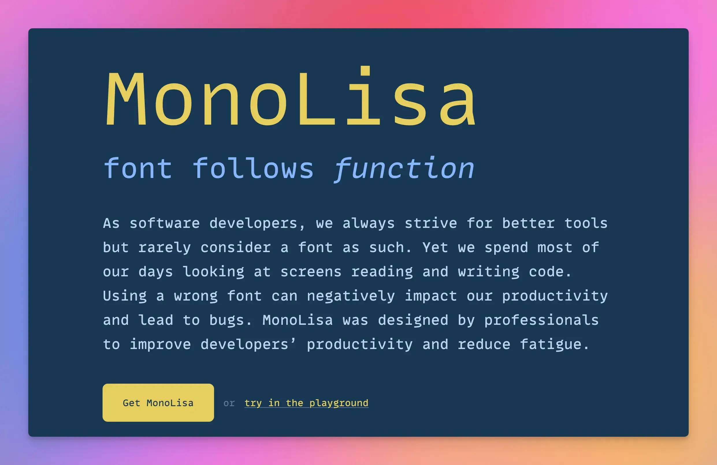
MonoLisa is a premium monospaced font crafted specifically for developers who prioritize readability, accuracy, and comfort during long coding sessions.
Key Features:
- MonoLisa is approximately 7% wider than standard monospaced fonts for more open and relaxed character shapes, reducing eye strain and improving readability.
- Special attention is given to differentiating commonly confused characters such as i, l, 1, 0, and O, minimizing the risk of coding errors.
- It offers a range of weights, from Thin to Ultra-Bold, letting developers customize the font’s appearance to their preference.
Who Is It Best For?
- It is ideal for those who spend extensive hours coding and require a font that reduces eye strain and improves readability.
- The font’s clarity and style make it suitable for teaching environments and presentations where code readability is important.
Fira Code
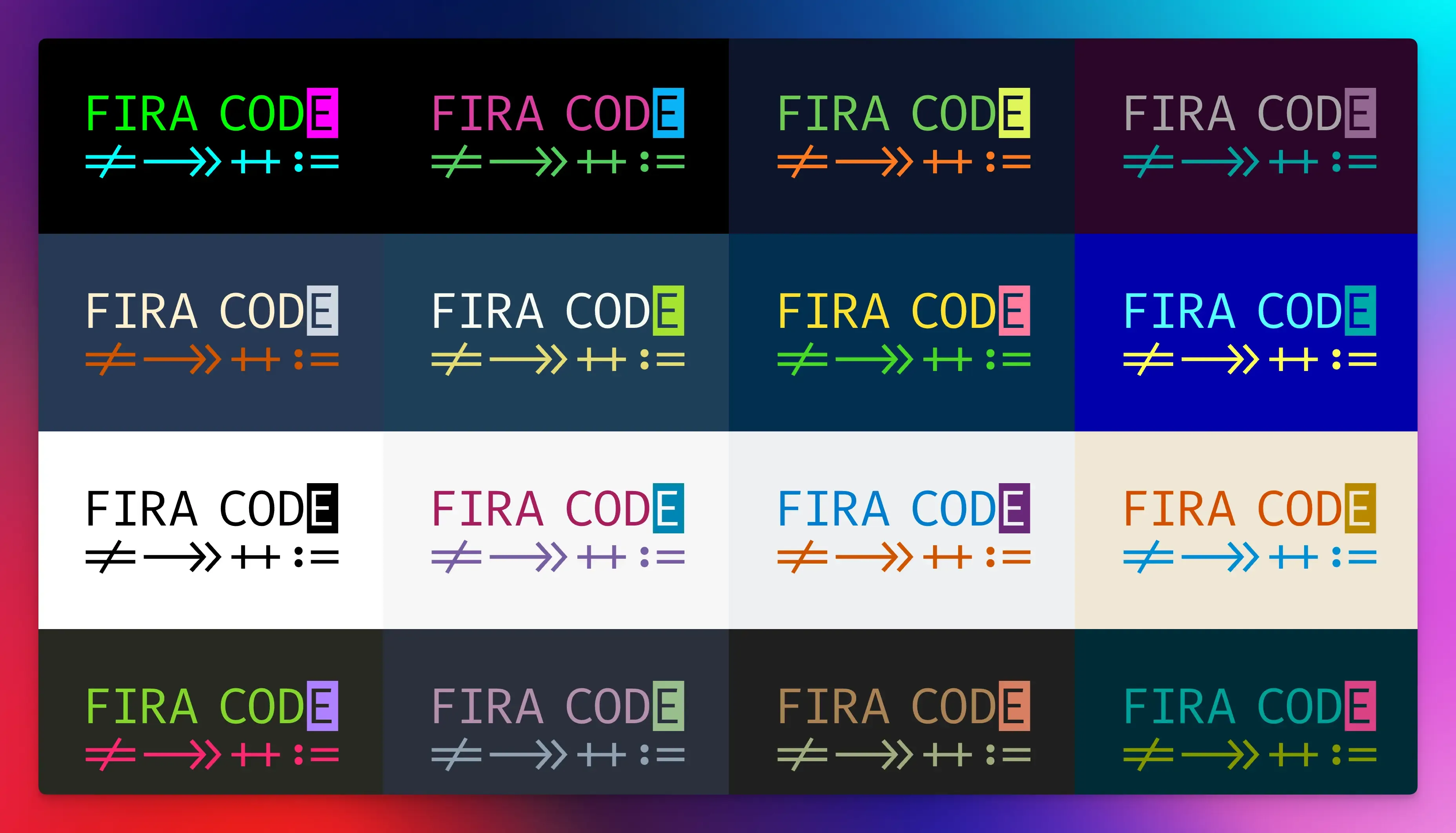
Fira Code is a monospaced font that uses ligatures to combine common operators into a single symbol for mathematical operations.
It is designed to reduce the time it takes to scan over your code and find what you’re looking for, making it a popular option for developers.
Key Features:
- It simplifies symbol-heavy code without breaking the monospace grid critical for alignment.
- Adjusts ligature intensity based on IDE zoom level.
- Open-source and free to use with a wide language and platform support.
Who Is It Best For?
- Developers who regularly switch between programming languages.
- Ligature enthusiasts who prefer a clean, modern design.
JetBrains Mono

JetBrains Mono is a monospaced font designed especially for developers.
It is optimized for readability, code clarity, and long programming sessions.
Key Features:
- Increases height for lowercase characters to improve readability at smaller font sizes.
- It has 142 code-specific ligatures, 8 weights with matching italics, and supports 152 languages.
- Oval characters are shaped to align with rectangular symbols to decrease visual distraction and facilitate vertical eye movement while scanning code.
- It is also free and open-source.
Who Is It Best For?
- Developers using JetBrains IDEs (IntelliJ IDEA, WebStorm, and PyCharm).
- Developers who prioritize a consistent visual experience.
- Ideal for multi-language developers.
Iosevka

Iosevka is one of the best fonts for programming, terminals, and software technical documentation.
It stands out for its exceptional build-time customization. Instead of switching features after installation, specify the glyph variants, widths, and ligatures you want, and then create a custom font to match your tastes.
Key Features:
- It offers 143 character variant features with 19 stylistic sets, which allows you to personalize one variant to fit exactly what you need.
- It supports language-specific ligations that you can choose to include or exclude.
- You can choose between monospace and quasi-proportional typefaces, which allow naturally wide glyphs to span two blocks, improving readability in text editors.
Who Is It Best For?
- It is ideal for developers who need narrow text for split-screen debugging.
- Developers seeking a custom typeface to meet their aesthetic and accessibility needs.
- Contributors to open-source projects.
Consolas
Consolas is a monospaced typeface introduced in Microsoft’s ClearType Font Collection.
It is the default system font for Windows and is still considered the best font for low-DPI monitors due to its ease of use and legacy support.
Key Features:
- Consolas uses Microsoft’s ClearType subpixel rendering to eliminate blur on legacy machines.
- It makes clear separations between 1 (one), l (lowercase L), and I (uppercase i), plus distinct bracket shapes to reduce look-alike errors in code.
- Its strong integration with Windows and Visual Studio provides consistent rendering across Microsoft’s development tools.
Who Is It Best For?
- Developers working on Windows platforms.
- Programmers who appreciate a bit of classical elegance in their code.
Hack
Hack is an open-source typeface with a clean design and generous spacing for large screens.
It is popular in programming communities for its clear rendering, and Powerline support out of the box.
Key Features:
- It provides monospaced regular, italic, bold, and bold italic to match all your syntax-highlighting needs.
- It has over 1500 glyphs, including Powerline glyphs, so you can theme your prompts and status bars without additional font patches.
- Zero ambiguity design (0 has a diagonal slash to prevent O confusion).
- It thickens strokes and increases contrast for dark themes, reducing glare during late-night coding.
Who Is It Best For?
- Developers that work with big, high-resolution displays.
- Coders who prefer straightforward fonts without ligatures or decorative elements.
Cascadia Code
Cascadia Code is a free, open-source monospaced font created by Microsoft specifically for modern terminals and command-line interfaces (CLIs).
Key Feature:
- Powerline glyphs (branch icons, arrows), built-in icons for Git status, Kubernetes symbols, and cloud emojis for PowerShell and CLI integration.
- Ligatures are optional and can be turned off using the Cascadia Mono version.
- It uses a unique cursive italics style for comments, making them softer on the eyes.
- Zero ambiguity design eliminates confusion between similar characters.
Who Is It Best For?
- Cloud/DevOps and terminal-centric developers.
- It works equally well on Windows, macOS, and Linux.
Source Code Pro
Adobe’s Source Code Pro is a monospaced font created focusing on legibility and typographic precision.
It avoids complex styles, favoring functional clarity, clean lines, and balanced proportions, making it a top pick for developers working with large Python or YAML files.
Key Features:
- Pixel-perfect spacing and well-defined shapes make it easy for the eyes to see.
- It comes in different weights to maintain identical character widths.
- It lets you switch weights without breaking alignment.
Who Is It Best For?
- Developers prioritize code alignment, readability, and consistency over flashy features.
- High-resolution screen users who need extra sharpness.
Input
Input is a highly customizable monospaced font family designed specifically for developers.
It offers modular customization and flexibility to adapt to developer preferences and coding environments.
Key Features:
- It offers 168 different styles to pick from.
- Adjust width, weight, and style to match your IDE or screen size.
- Its adaptive monospace mode maintains alignment while subtly adjusting character widths for enhanced readability.
- Zero ambiguity with optional serifs/slabs to prevent misreads.
Who Is It Best For?
- Developers who want precise control over font appearance.
- Perfect for those switching IDEs, terminals, and documentation tools.
Ubuntu Mono
Ubuntu Mono is a part of the Ubuntu typeface family, designed for those who prefer a font that just works without customization.
While originally created for Ubuntu’s terminal and coding environments, its balanced design and readability have made it a favorite across platforms.
Key Features:
- Uses curved letter terminals and open shapes to reduce visual fatigue during long coding sessions.
- Characters have distinct designs and are separated to avoid confusion.
- Works well on Linux, macOS, and Windows.
Who Is It Best For?
- Fans of the Ubuntu style.
- Developers who prefer a softer and more relaxed visual style.
Model Mono
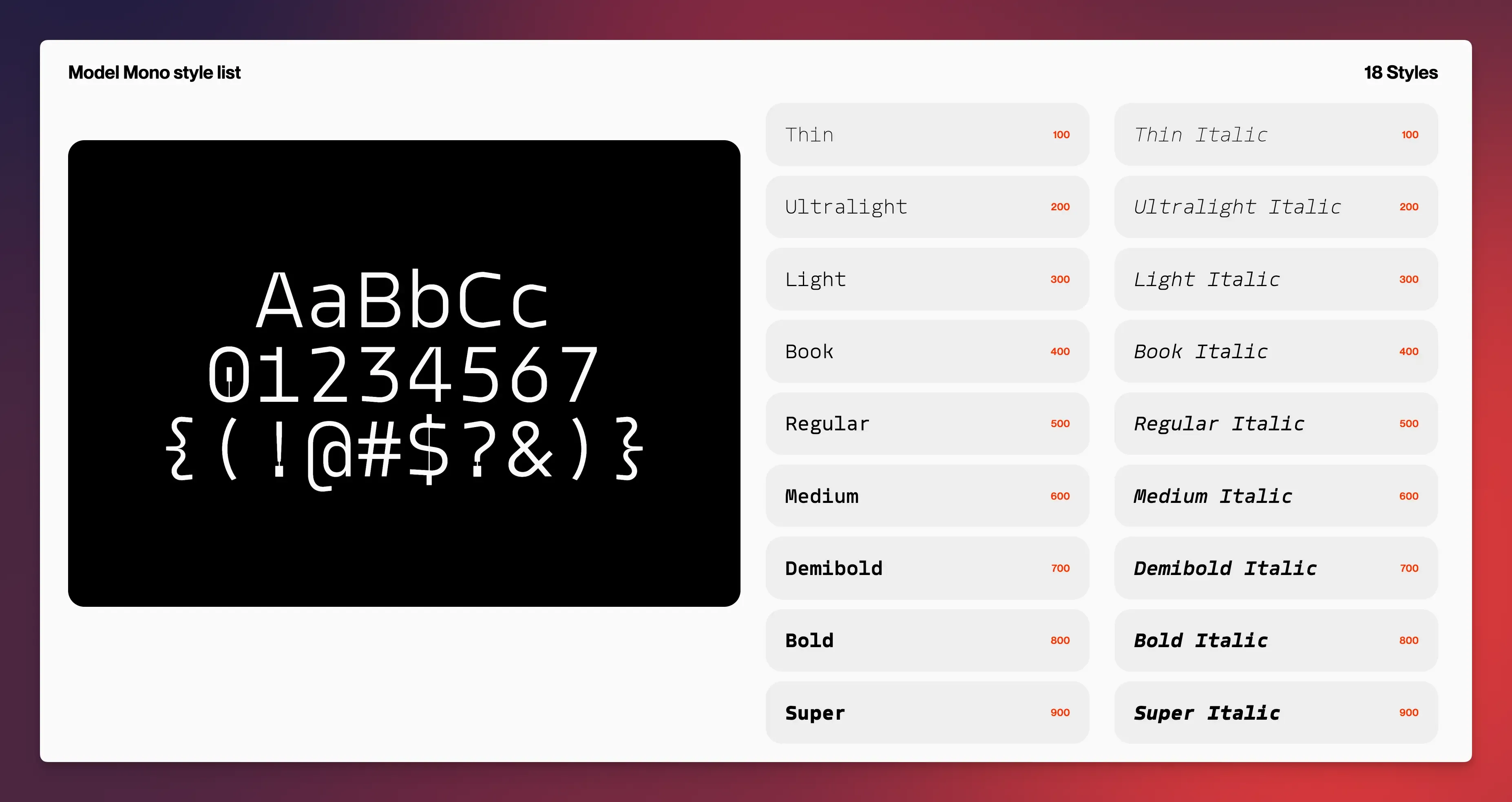
Model Mono is a modern monospaced font designed especially for coding.
It balances classic typeface elegance with practical coding needs to emphasize readability and visual harmony.
Key Features:
- It includes 18 styles with 626 glyphs each for flexible use.
- Context-based ligatures and distinct characters to avoid errors.
- Slightly rounded letters ends for a softer, more approachable look.
Who Is It Best For?
- Use it if you want your code to look neat and polished look without sacrificing readability.
- Coders who need a balanced contrast and open shapes.
Menlo
Menlo is a monospaced font designed by Apple for use in macOS and iOS development tools.
While it’s no longer the default in newer macOS versions (replaced by SF Mono), Menlo is still a popular choice among developers because of its readability and regular spacing, which are essential for long coding sessions.
Key Features:
- It is derived from DejaVu Sans Mono, which has a modern style and higher weight for terminal reading.
- Minimalist design without ligatures or decorative elements for pure monospace clarity.
- High legibility and low resource usage, ideal for small screens, virtual machines, or legacy tools.
Who Is It Best For?
- Perfect for macOS developers.
- Use it if you value simplicity and native tool integration over customization.
Monaspace
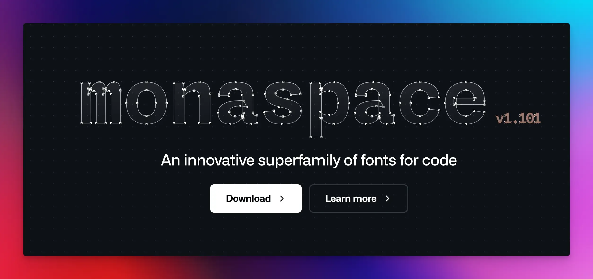
GitHub developed Monaspace, a variable font family for modern coding environments. It is a popular choice for developers who value adaptability and comfort.
It consists of five interchangeable sub-fonts (Neon, Argon, Krypton, Xenon, and Radon) optimized for different coding scenarios. You can mix and match them to create a more expressive font style.
Key Features:
- Adjusts weight, width, and spacing dynamically based on context to balance screen space and clarity.
- Its texture healing feature reduces visual noise by adjusting glyph shapes in large code blocks.
- Includes 640k styles and code ligatures for a wide range of programming languages.
Who Is It Best For?
- Perfect for developers working with multiple environments.
- Coders who prioritize eye strain reduction and code clarity over fancy visuals.
Final Words
Choosing a font that offers an optimal reading experience is essential for reducing eye strain, headaches, and errors in your code.
Do research, test what works best for you, and then decide.
Remember: the best font for you is the one that disappears, letting you focus on your code instead of letters.
FAQs
Serif vs. Sans-Serif: Which is better for coding?
Sans-serif fonts, such as JetBrains Mono and Fira Code, are better for coding due to their clean, screen-optimized readability.
What's the biggest mistake people make when picking a coding font?
Choosing based on trends, not their workflow. A font that’s popular for JavaScript might overwhelm a Python dev who needs clean indentation. Always test fonts in your IDE during your longest coding hours.