How to leverage form elements
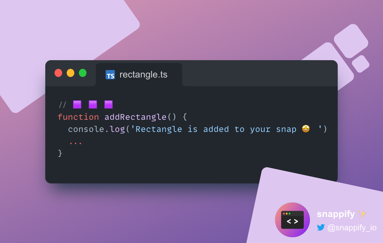
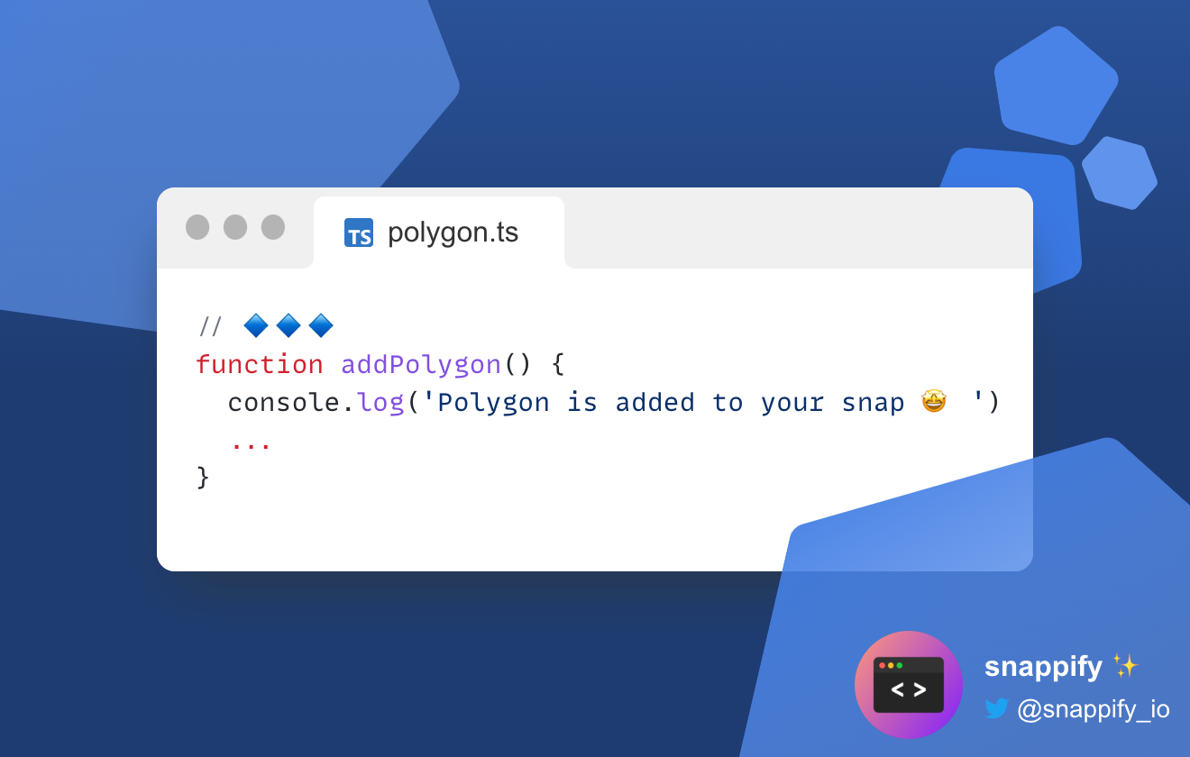
Lately, we added the possibility to enrich your snaps with common form elements, like a triangle, rectangle, or polygon with a configurable edge count.
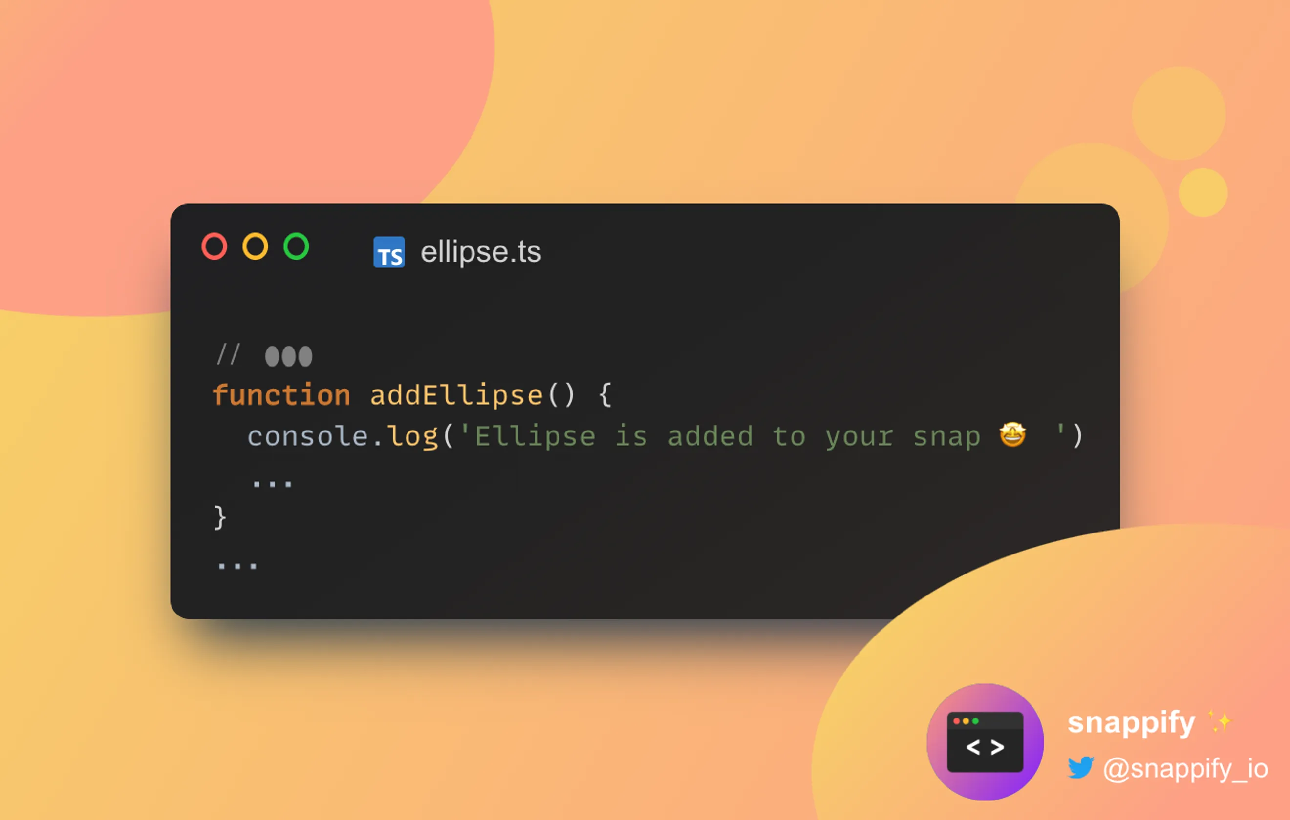
Today we want to dive deep into the ellipse form element and how we can use it to make our snap presentation prettier. We’ll build the following snap step-by-step and at the end, you can copy it into your dashboard and customize it as you desire.
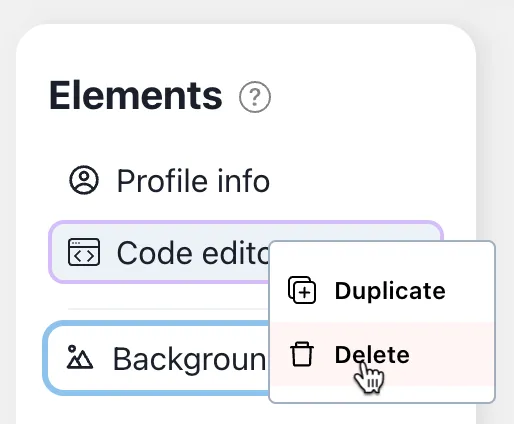
Let us start creating a new snap on the Dashboard. As soon as the default snap opens in the editor, remove all elements. Right-click on each element on the left toolbar to open the context menu and choose the “Delete” option.
Step 1 - Adjust the background
First we choose the background by clicking on it on the canvas. On the right toolbar, you will always see all the configuration possibilities of the currently selected element. We want the dimension of the background to be 660x420. So put those values on the right toolbar.
660
420
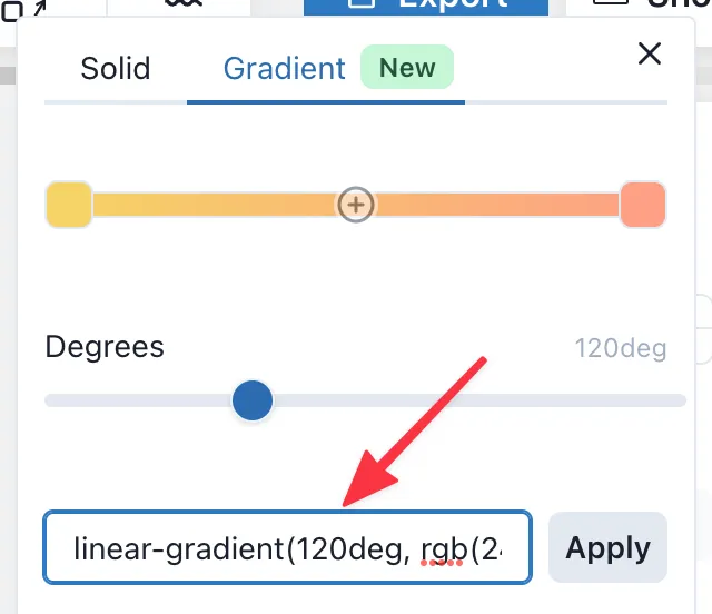
Since we also want a different background color, we’ll change the default one by clicking on the “Color” field to open the
gradient color picker. There you’ll see an input “Enter CSS Gradient”.
Put linear-gradient(120deg, rgb(246, 211, 101), rgb(253, 160, 133)) and click on the “Apply” button. Done 🙌
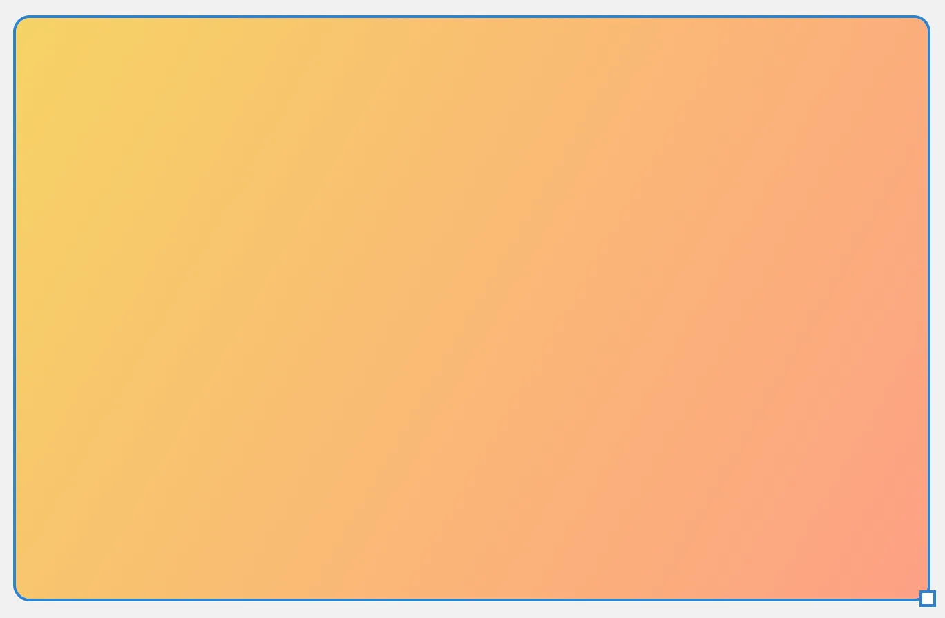
Now we have a nice color gradient for our snap.
Progress: This is how the snap should look like.
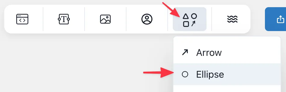
Step 2 - Add 2 Ellipses
As next, we’ll create the Ellipses on the top-left and bottom-right. Add an ellipse form into your snap.
Select the ellipse and put those values on the right toolbar:
-160
-115
413
277
Hint: Of course you can drag&drop and resize the form elements on the canvas freely as you may used to from other advanced design tools like Figma.
Next change the color and for that we’re going to use the exact same color gradient as the background.
So click on “Color” and open the “Gradient” tab and put again linear-gradient(120deg, rgb(246, 211, 101), rgb(253, 160, 133)) and
click on “Apply” button.
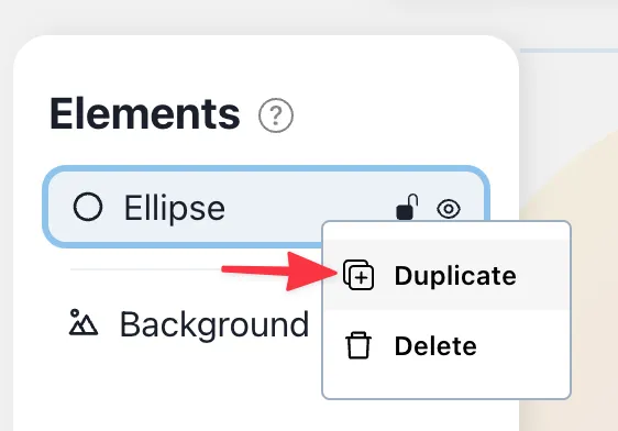
Tadaa! The first Ellipse is created 🥳. For the second one, we’ll simply duplicate the first one. To do that open the context menu of the first ellipse and choose “Duplicate”
Select the second ellipse and put those values on the right toolbar.
415
268
398
255
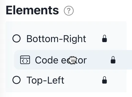
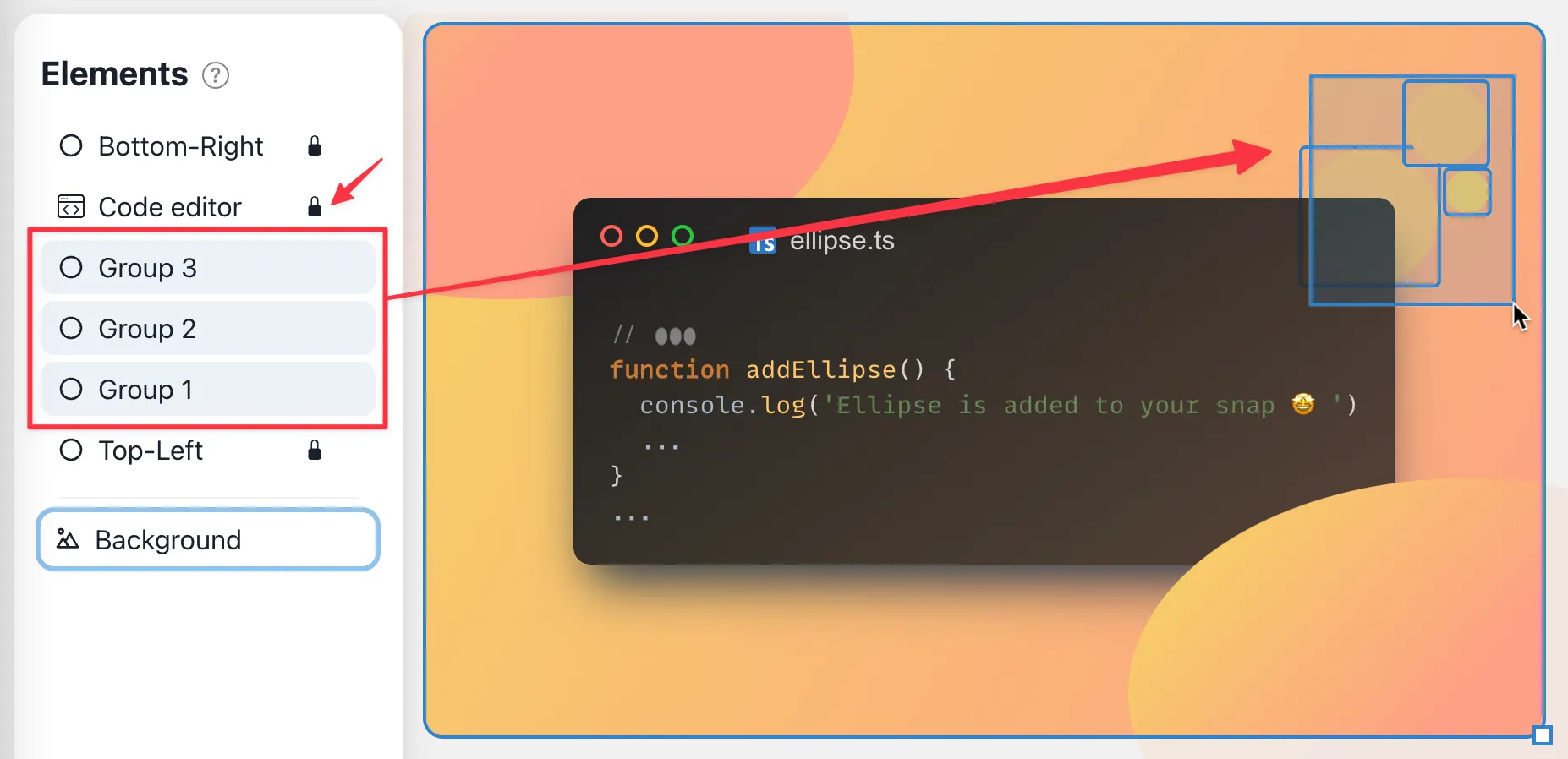
Basically, this was the second ellipse, but there is one important step left. The second ellipse should always stay in the bottom-right corner. No matter if the snap background gets smaller or bigger. In order to achieve that we need to adjust the “Position Constraint” on the right toolbar and assign a new name. Click on the right and bottom line.
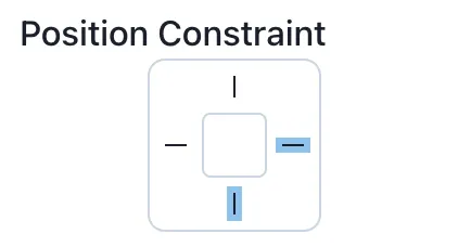
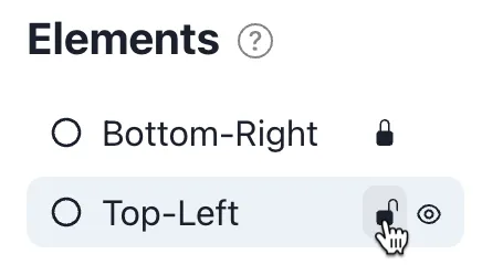
We recommend to rename the elements to have a better overview. To do that, just double-click on the element in the left-toolbar. We name them “Top-Left” and “Bottom-Right”.
Pro: Tip 💡
Lock both ellipse elements by hovering over them on the left toolbar. While hovering, the lock icon will appear. If an element is locked you aren’t able to select this element on the canvas which prevents you to select it accidentally.
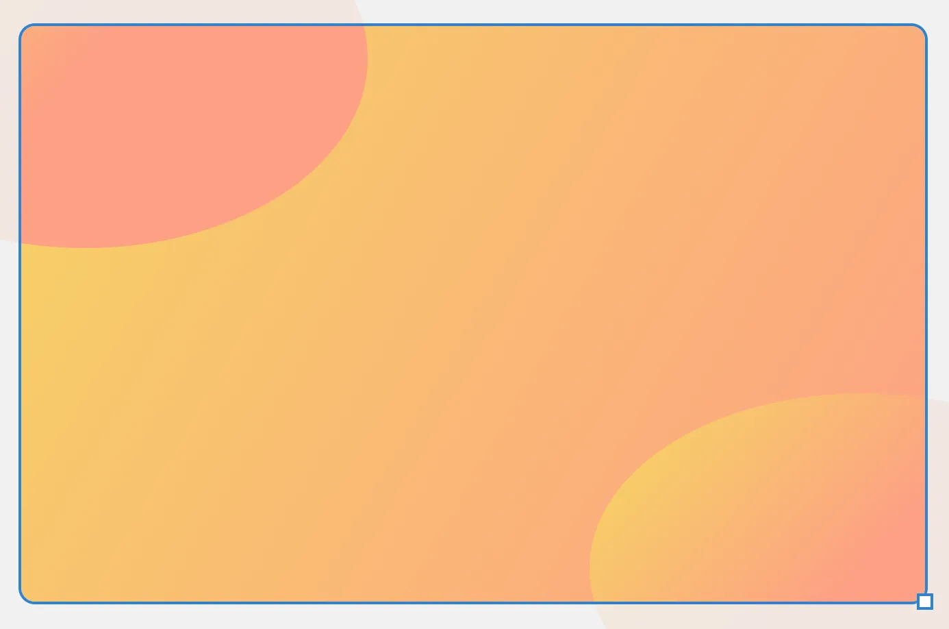
Progress: This is how the snap should look like.
Step 3 - Add Code-editor
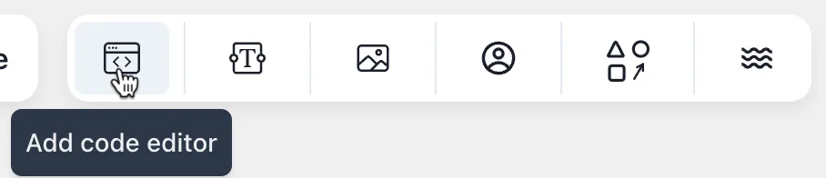
What is a snappify Snap without a code-editor, right? Let’s add a code-editor from the top toolbar.
So on the right toolbar we now see much more configuration options. For this tutorial we’ll only go through the options we need, but feel free to play around.
First, we’ll change the “Theme” click on the dropdown and choosing the option “darcula” as this fits pretty well with our design colors. Next, we’ll change the “Window Control”. Open the accordion and select the third option (colored outlined), and paste the following code as a placeholder.
Next, we want to adjust the background of the code editor a bit. Click on “Editor color”, go ahead to the “Gradient” tab, and
paste linear-gradient(145deg, rgb(32, 32, 33), rgba(32, 32, 33, 0.75)) into the input and click on “Apply”
We also want to place the code-editor in the center of the snap. In order to do that just drag the code-editor to the center. The snapping guideline will help you to center the code-editor perfectly. 🙌
Now we activate all lines of the “Position Constraint” so that the code editor stays centered, even when we resize the snap.
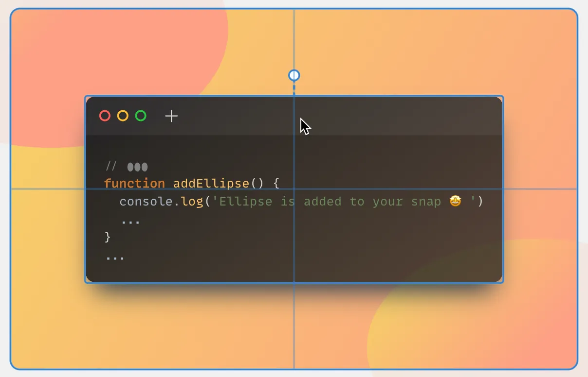
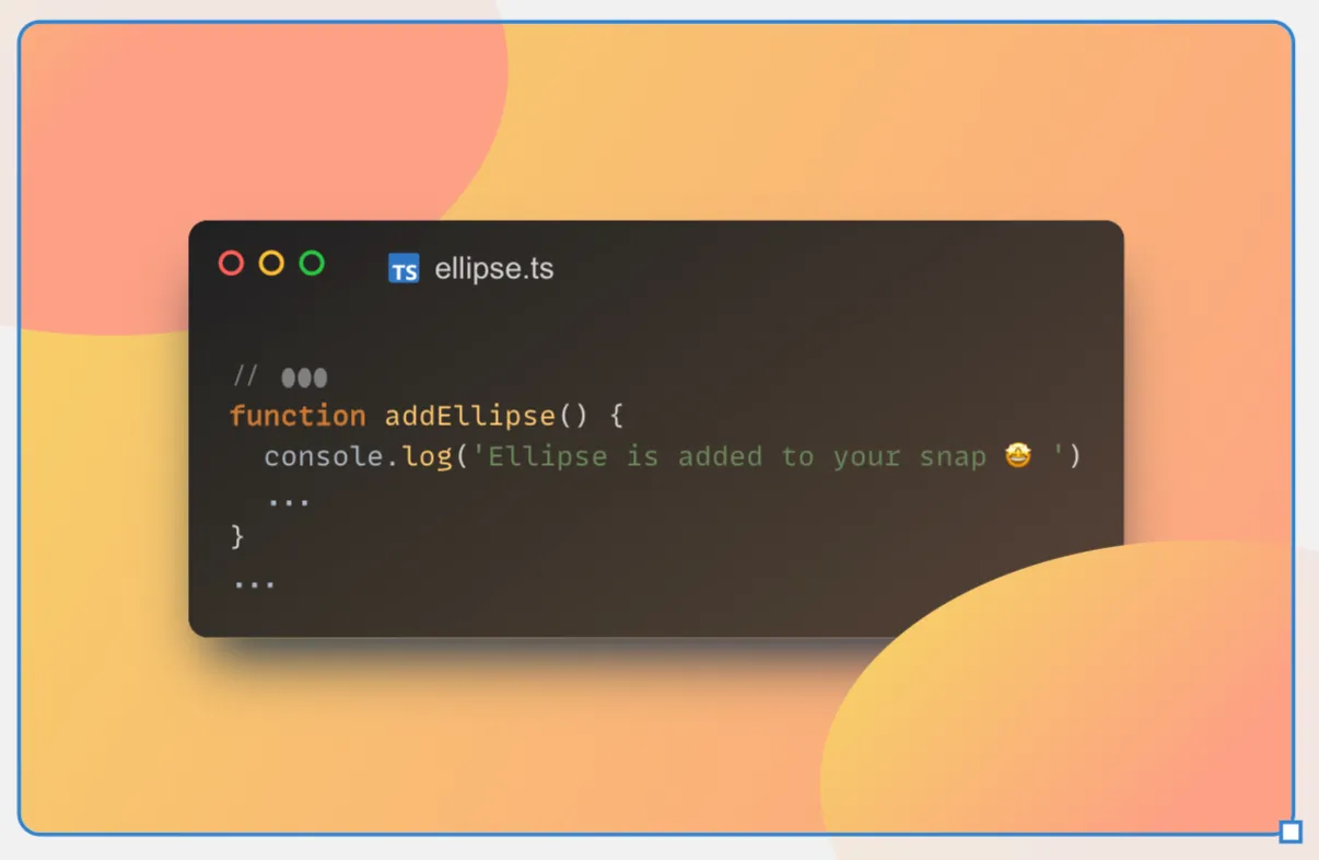
As you can see the ellipse on the bottom-right is behind the code-editor. This is because of the order of the elements listed (z-index). So we just need to place the code-editor before the bottom-right ellipse. For that, we’ll just drag the “Code editor” element and drop it between the “Ellipse” elements.
Optional Step: click on the ”+” icon of the code-editor tab to add a filename. In this case, we added “ellipse.ts”.
Progress: This is how the snap should look like.
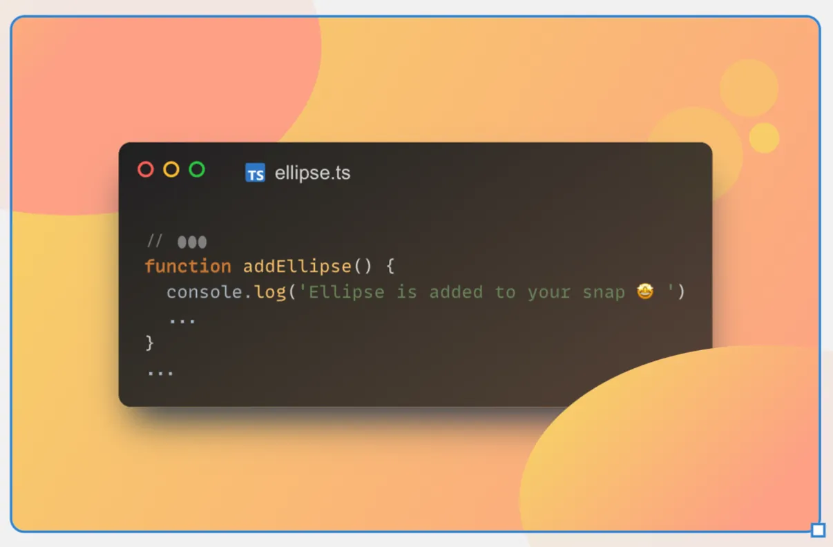
Step 4 - Add 3 small circles
Well, the snap is already looking pretty good, but the final touch is missing. So let’s create 3 small circles on the top-right corner of the code-editor. Add an “Ellipse” form element from the top toolbar. And put those values on the right toolbar.
518
73
80
80
F9BF71FF Since the circle should be behind the code-editor we’ll drag the first circle below the code-editor in the element-list. As next, duplicate the first circle and put those values on the right toolbar.
579
34
48
48
Duplicate the second circle again and put those values on the right toolbar.
603
86
25
25
F7CC6AFF For all three circles, activate the top and right lines of the “Position Constraint”.
Hint: If you resize an ellipse element on the canvas freely, you can press Shift key to get a circle. This works for the other form elements as well.
Progress: This is how the snap should look like.
Pro: Tip 💡
You can select all circles by a drag selection so you can easily reposition them together. Make sure to lock the code-editor before so it won’t be included in the selection.
Step 5 - Add your Profile-info
Last but not least we’ll add the Profile-info element from the top toolbar and put those values on the right toolbar.
470
346
Activate the right and bottom lines of the “Position Constraint” like we did for the second ellipse to pin the Profile-info on the bottom-right corner.
Finally we did it 🥳
Copy to your dashboard
We also created two additional versions of this snap (blue and purple). Feel free to try it out and customize them on your own.